
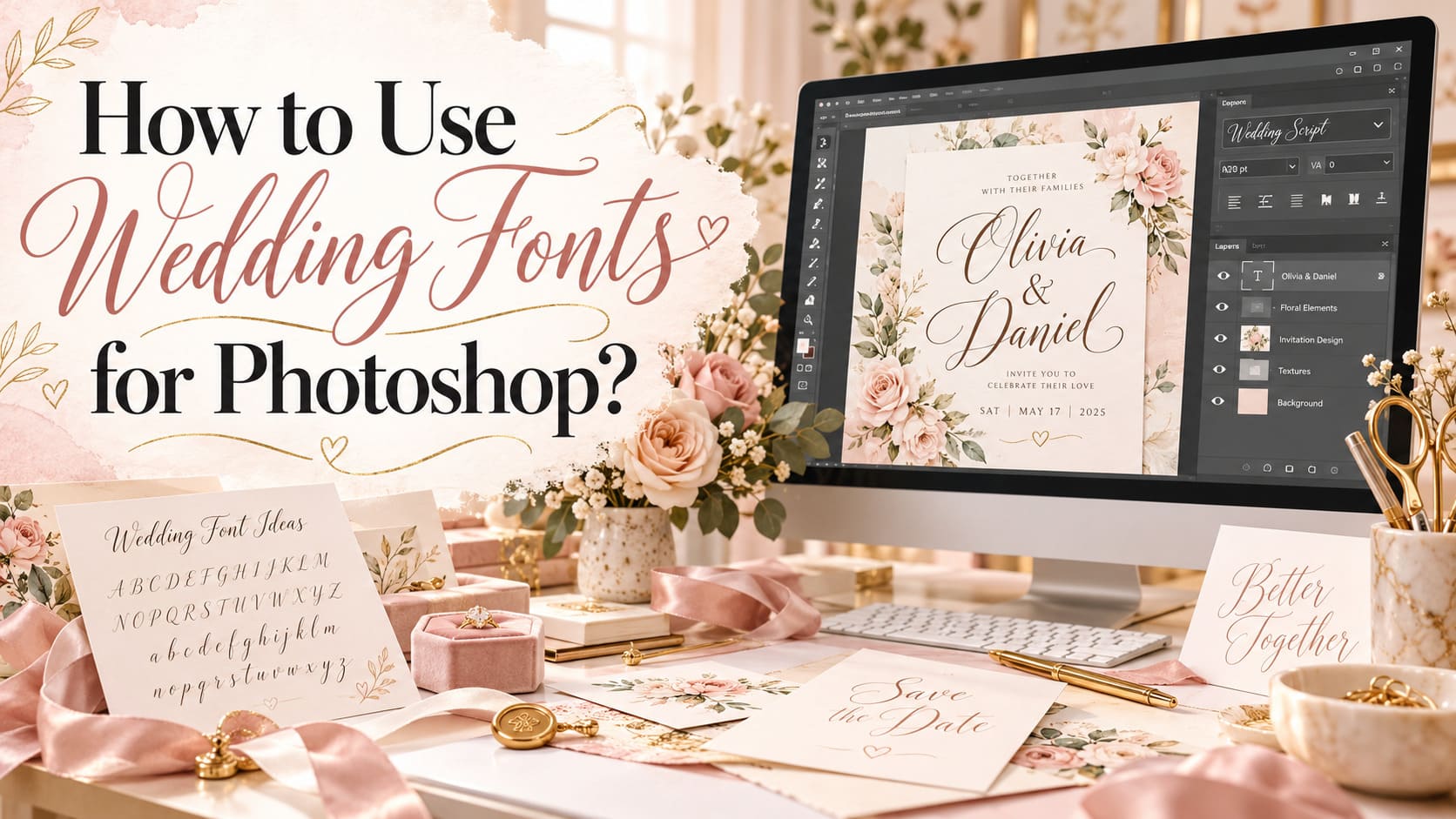
An invitation can use a beautiful script and still be hard to read. Installation, spacing, text hierarchy, and export settings determine how the lettering works on the finished card. If you have downloaded wedding fonts for Photoshop and cannot find them in the font menu, or your calligraphy looks nothing like the specimen, the steps below will help you work through it.
This guide explains the desktop process on Windows and macOS, shows how to create an editable invitation with two complementary type styles, and addresses swashes, missing fonts, and print preparation. You will also find six downloadable Creative Fabrica font examples selected for different jobs, from elaborate couple names to practical venue details. You can practice every step with fonts you already have.
Practical instructions are based on Adobe, Microsoft, and Apple documentation. The product examples are editorial suggestions, not personally installed or printed tests.
Quick Answer: How Do You Use Wedding Fonts in Photoshop?
Download → Extract → Install → Open Photoshop → Choose the Type Tool → Select the font → Format and save. Fonts downloaded from a marketplace normally arrive in a compressed folder. Extract it, locate an installable .otf or .ttf file, then install that file in Windows or macOS. After opening Photoshop desktop, choose the Horizontal Type Tool, create a text layer, and select the installed family from the font menu. Adjust size, tracking, leading, and any supported special glyphs before exporting your design.
Photoshop reads fonts available to the operating system; a specimen JPEG cannot be installed as a typeface. Adobe Fonts also provides a separate activation method through Creative Cloud. Use the installation steps below. Do not drag a ZIP archive into the Photoshop canvas.
What You Need Before Using Wedding Fonts in Photoshop
You need Photoshop desktop, a font you are licensed to use, and a clear idea of where the finished design will appear. A digital save-the-date and a printed invitation need different export settings. Before you start, check whether the font is a regular installable typeface, a collection of decorative image files, or both. A marketplace preview can conceal the difference.
- Working software: Photoshop on Windows or macOS, not an unrelated mobile editor or Adobe Express tutorial.
- Font package: extract and inspect the download for OTF/TTF files and any readme or stylistic guide.
- Invitation copy: the couple’s names, date, location, RSVP instructions, and any important accessibility information.
- Output specification: final dimensions, print or digital use, and printer requirements if a physical card is planned.
- Permissions: confirm the product’s license covers the design and delivery method you intend.
A PNG of elaborate lettering can be placed in Photoshop like an image, but it will not become editable text. An installable typeface lets you revise a surname directly in its text layer. Store the font purchase information alongside the working project in case the design needs to be revised months later.
How to Install and Use Wedding Fonts in Photoshop
The instructions here cover current Photoshop desktop workflows. Some panel layouts vary slightly across workspaces and releases; when a panel is hidden, use the named Window menu entry rather than relying on where a screenshot says it should be.
Step 1: Download a Wedding Font
Choose an actual font listing from a legitimate source and check what the seller says is included. After downloading, move the ZIP to a sensible project folder and extract its contents. Look for files ending in .otf (OpenType) or .ttf (TrueType). A preview image, a PDF example, and an SVG graphic may be helpful references, but none replaces the font file. If you see multiple weights or separate script and sans files, install the styles you intend to use.
Check file names, internal family names, and licensing notes before typesetting the invitation. The marketplace’s product title is not always the exact family name shown inside an app. If a download does not contain an installable font file, contact the seller rather than changing the file extension. Renaming a JPG to .otf does not produce a usable font.
Step 2: Install the Font on Windows or macOS
Windows: after extracting the ZIP, right-click the .otf or .ttf file and choose Install. Windows may also offer Install for all users, which can require administrator rights. Open the font file first if you would like to preview the alphabet. This is operating-system installation; there is no need to drag the font into a Photoshop image. The method is documented by Microsoft’s font installation guidance and Adobe’s Photoshop font tutorial.
macOS: open the downloaded font file in Finder and select Install when Font Book opens. You can also add fonts directly through Font Book. macOS validates imported fonts and may warn about duplicates; check those warnings instead of installing many indistinguishable copies. Apple’s Font Book instructions explain the current workflow.
If Photoshop was already running during installation and the font does not show up, close and reopen the application before investigating more complicated causes. Installing a system font and activating a family from Adobe Fonts are distinct routes. For the latter, Creative Cloud’s Fonts area lets you browse and add an Adobe Fonts family; it is not where you paste arbitrary marketplace ZIP files.
Step 3: Find the New Font in Photoshop
Open Photoshop desktop and create a new document or open an existing PSD. Select the Horizontal Type Tool from the toolbar (the familiar T-shaped icon). Click once for a short line of point text, such as the couple’s names, or click and drag to create a paragraph-text box for longer instructions or addresses. Photoshop makes a separate, editable type layer. Its thumbnail has a T icon in the Layers panel.
With the type layer selected and the text active, use the font family menu in the options bar or Character panel to choose the new family. Search both the family name and the product title if it is hard to locate. Type a short proof containing capitals, lowercase letters, numbers, and punctuation: Emma & Noah · October 24, 2026 · 5:30 p.m. This short proof exposes unusual numerals, missing punctuation, and hard-to-read characters.
The text remains editable as long as it stays a type layer. Adobe’s type-layer documentation explains why this matters: you can revise the spelling, switch families, and adjust dimensions before final output.
Step 4: Customize Size, Spacing, and Alignment
Open Window > Character to see the typography controls. Font size determines the overall scale of the selected text. Tracking increases or decreases spacing across a selected range; it is useful when a line of all-capitals needs more breathing room. Kerning handles spacing between individual letter pairs, such as an awkward capital A next to a V. Leading sets the distance between baselines in multi-line text. Each adjusts a different part of the composition.
Set the names first and judge their visual width. Then format the date and venue as separate text layers, usually with a simpler typeface and more restrained size. Try optical kerning where a mixed-size display heading looks uneven, while remaining aware that the selected font may already contain useful kerning information. Adobe’s Character spacing guide distinguishes the settings and their effects.
Alignment changes how guests read the invitation. Centered text can reinforce a traditional formal look, but it gets harder to scan when several long lines share almost the same width. Left-aligned details often help modern invitation layouts, especially when an address or parking instruction wraps to two lines. Judge the balance at the intended final size. Zoomed-in screen previews can make a thin script look more readable than it will be on a small card.
Step 5: Use Decorative Glyphs and Swashes Carefully
Some wedding fonts include alternate capital letters, swashes, or ligatures. Others contain only the standard alphabet. If the seller advertises a PUA-encoded character set, the extras may be accessible through system character tools or Photoshop’s Glyphs panel, depending on the actual font. Open Window > Glyphs, position the cursor in an editable type layer, and inspect the glyphs supplied by the selected font. Adobe documents double-clicking a glyph in the panel to insert it into the text.
For supported OpenType fonts, select the relevant text and open the Character panel’s menu to find OpenType features such as discretionary ligatures, contextual alternates, or swashes. If a control is unavailable, check whether the font and selected characters support that feature. Check the spelling after inserting a decorative character. Some ornament shapes are easily mistaken for letters.
Use a flourish on the first or last letter of the couple’s names, then inspect the gap between the flourish and nearby lines. Do not use ornamental swashes for an RSVP email address, accessibility note, or venue name that guests must read quickly.
Step 6: Create an Elegant Wedding Typography Layout
Split information into a few visual levels. The couple’s names are usually the main display element; the ceremony date and venue form the second level; practical details and RSVP instructions sit at a smaller, readable size. Keeping these pieces in separate type layers makes spacing corrections easy. Place each type layer deliberately rather than repeatedly adding spaces inside the text to fake alignment.
Choose a script with personality for the names, then introduce a restrained serif or sans serif for everything guests need to act on. Let the supporting font be quieter than the names. If you add floral artwork or a line drawing, treat it as a frame for the information rather than decoration that fills every empty corner. Leave visible separation between long calligraphy strokes and other elements.
Layer styles are optional. A modest color treatment can help a title. Thick bevels, gradients, and shadows tend to obscure fine strokes in print. Test the result on an actual-size proof, not only at 200% zoom. Preserve the text layers so names, venue details, and dates remain editable.
Step 7: Save and Export Your Wedding Design
Save a working PSD before preparing a deliverable. The PSD retains editable text, positioning, and any supporting layers, so you can correct a typo without rebuilding the document. Rasterizing a type layer converts its letters to pixels and prevents ordinary text editing. Duplicate first if a particular effect requires destructive editing.
For printing, ask the provider which finished size, bleed, color profile, and delivery file they require. Adobe describes 300 ppi as a common high-quality print starting point; it is not a universal requirement for every printer or output size. The correct PDF, TIFF, or other output may depend on that provider’s workflow. For digital sharing, export an appropriately sized image after you have checked text legibility on a phone screen. Keep the PSD as your source regardless of the delivery format.
Example: Designing a Romantic Wedding Invitation in Photoshop
Imagine a garden wedding invitation for Emma Rivera and Noah Chen. The card needs to show the couple’s names, Saturday, October 24, 2026, a 5:30 p.m. ceremony, the venue, and an RSVP deadline. Your goal is a clear reading order with enough personality to feel celebratory.
Start a new Photoshop document with the intended physical card size. As an example, a 5-by-7-inch invitation at 300 ppi would use 1,500-by-2,100 pixels before any printer-specific bleed is added. This is a working example, not a universal print specification. Ask the print vendor whether the final file must extend beyond the trim line and by how much.
Add a light warm background and keep its decoration subtle. Use one script type layer for Emma & Noah. Move it into the upper half of the card, leaving space for a simple line such as invite you to celebrate their marriage. If your script has an alternate E or N, insert it only when the result stays clearly readable. At this stage, the size matters more than decorative effects: a beautifully flourished word that occupies the entire card leaves no room for directions.
Next, add the date and time in a restrained serif, perhaps in spaced capitals, followed by the venue in a plain sans serif. You now have a simple hierarchy: names, ceremony, details. Use the Move Tool to align separate layers; use Character tracking for the all-cap date rather than inserting spaces between individual letters. Zoom out, then inspect at approximately the card’s true printed dimensions. If the venue is hard to read, make its type larger or stronger before touching the names.
Finally, group related layers logically and save the editable PSD. Make a low-cost proof print if available. Check the full names, date, punctuation, color contrast, and all small information before exporting according to the printer’s requirements. You can use the same design structure for a save-the-date by shortening the details rather than shrinking the entire layout.
Beautiful Wedding Fonts to Try in Photoshop
These six typefaces illustrate useful roles within a wedding design rather than forming a best-to-worst ranking. The descriptions come from the corresponding Creative Fabrica listings and a review of the available preview information. We did not download, install, print, or test the font files in Photoshop. Before purchasing, confirm the included files and the license for your project.
Ashley Marie Font
A ready-made contrast between decorative and functional lettering
Editorial font inspiration
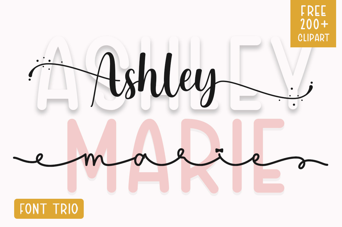
Seller-provided type specimen, not a Photoshop test screenshot
Ashley Marie is described by its seller as a duo with a script and a sans serif component. That makes it an interesting starting point for a coordinated invitation, where expressive lettering can carry the couple's names and the plainer face can carry practical details. Instead of choosing two unrelated families, a designer can start with the two contrasting styles from the same product and see whether their proportions suit the desired mood.
In Photoshop, use a separate editable type layer for each role. Avoid setting the entire invitation in the script; test the sans portion at a realistic print size and confirm that punctuation and numerals look clear. The duo still deserves an ordinary proof read. Even related styles need a proof layout. If the script fills most of the width, increase whitespace around it rather than squeezing the supporting line into tiny text.
Check exact font files and license before use.
Maddison Font
Warm calligraphy for names on an invitation cover
Editorial font inspiration
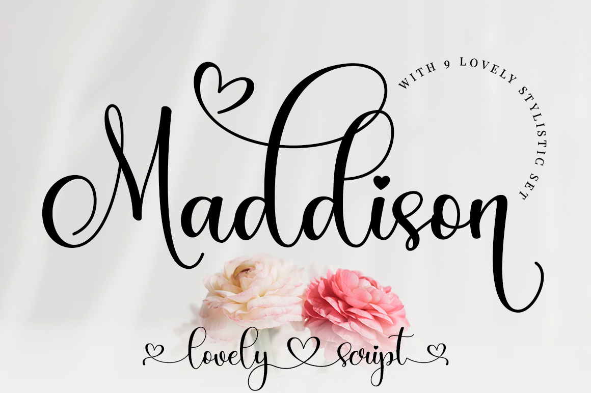
Seller-provided type specimen, not a Photoshop test screenshot
Maddison is a romantic calligraphy face with a moving, informal baseline, according to its Creative Fabrica listing. Its uneven rhythm suits two large first names on a garden-wedding invitation or informal save-the-date. The seller also describes it as PUA encoded, so extra decorative glyphs may be available to explore after installing the actual font file.
Make the names a distinct Photoshop type layer and audition them with and without alternate letters. A swash can help the line feel customized, but a crowded cluster of flourishes may make two names appear like one word. Put the date and address in a serif or sans that readers can understand instantly. Avoid Maddison for a long RSVP line: the shifting baseline makes small details harder to scan. Think of it as an expressive heading, not an all-purpose information font.
Check exact font files and license before use.
Ethereal Font
A classic serif structure for ceremony details
Editorial font inspiration
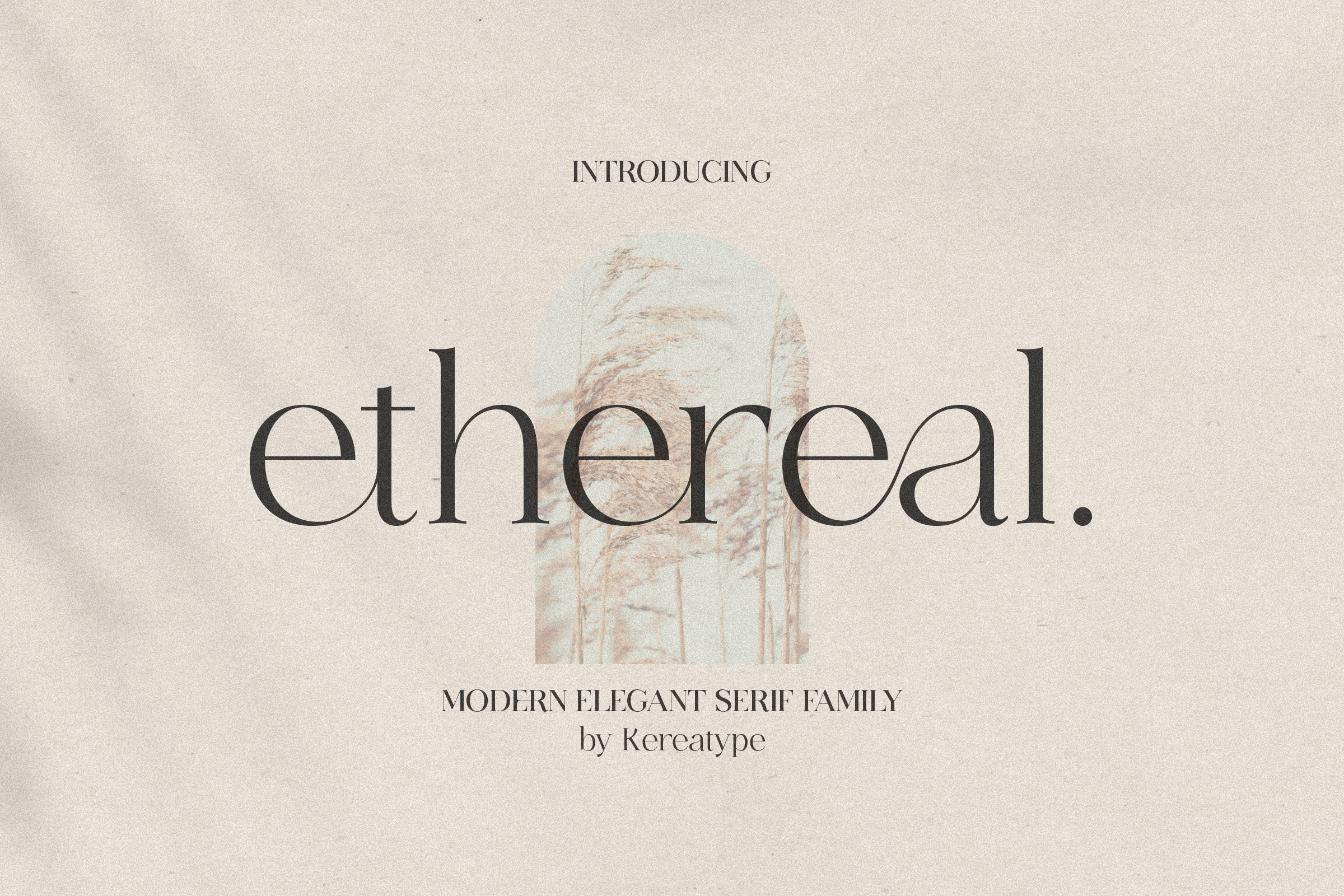
Seller-provided type specimen, not a Photoshop test screenshot
Ethereal brings a different shape to the gallery: a modern serif family whose listing advertises several weights. If you prefer invitations that resemble editorial stationery, a serif can provide more of the visual identity than a script does. Try its restrained weights for a large formal date line or the venue's name, then reserve the bolder options for headings that need stronger emphasis.
Photoshop's Character panel lets you examine how a given weight interacts with tracking and leading. A fine-weight serif on low-contrast paper can look delicate on screen yet become weak after print reproduction, so compare options at intended card size. Do not assume every weight will behave identically. Ethereal can work as a main family with a small handwritten accent, but it can also stand alone when the invitation needs a particularly quiet, typographic look.
Check exact font files and license before use.
Minimalist Font
A calm sans serif for information people need to read
Editorial font inspiration
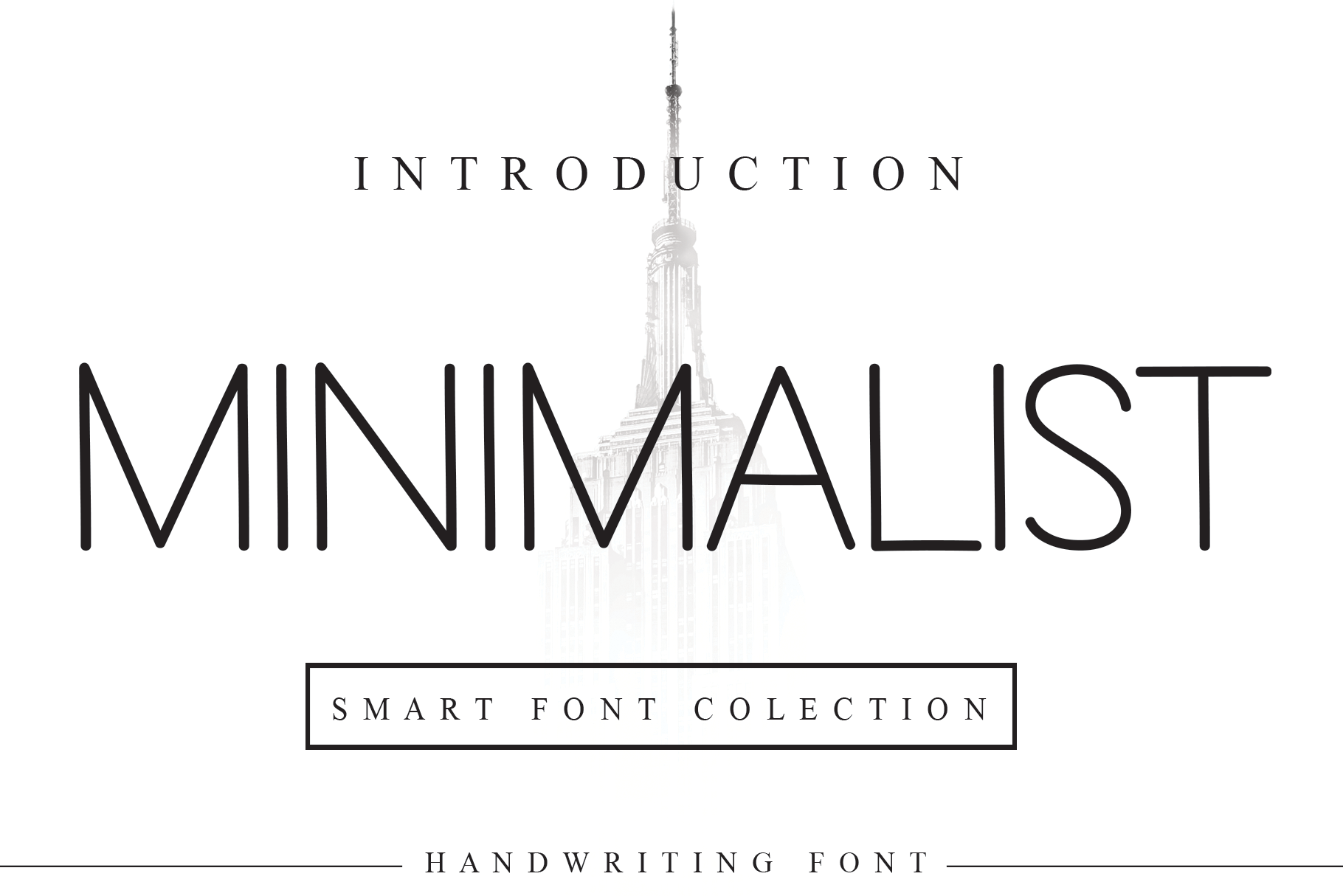
Seller-provided type specimen, not a Photoshop test screenshot
Minimalist is described by the seller as a neat, pared-back sans serif. Its quiet geometry suits supporting text that ornate calligraphy would overwhelm. Venue names, travel directions, RSVP links, and menus are usually more important to understand than to decorate. A simple sans gives those lines space to do their job without imitating hand-lettered names.
Pair it with a larger script title and keep size, contrast, and line breaks consistent across the details. If the text is going to be read on a phone, check it at the phone's actual viewing scale. Minimalist is not necessarily the best single typeface for a romantic headline; used alone, its restraint may feel too spare for a traditional invitation. Its strength is a supporting role that keeps the overall layout usable.
Check exact font files and license before use.
Baby Boho Font
Relaxed swashes for informal wedding pieces
Editorial font inspiration
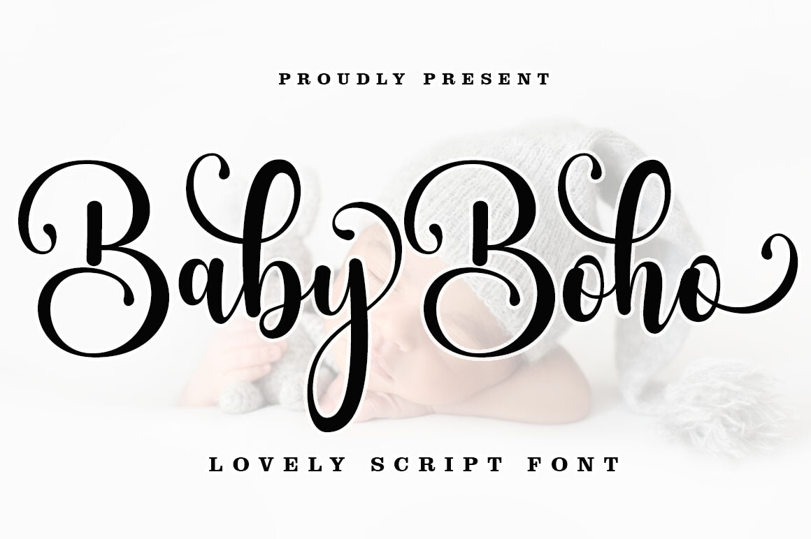
Seller-provided type specimen, not a Photoshop test screenshot
Baby Boho's seller describes a casual modern calligraphy style and PUA-encoded swashes. It fits a less formal stationery direction: a welcome-card title, bohemian save-the-date, gift tag, or brief printed message. The style can feel personal without requiring a polished black-tie script, especially alongside generous spacing and an uncomplicated background.
Its extra strokes still need to earn their place. On a small favor label, a long entry swash may collide with the edge of the card or make the first letter hard to decipher. Start with the ordinary characters, set the phrase at the size you will use, and only then add alternates in Photoshop if the supplied file supports them. A companion sans serif works well for dates or logistics. The product preview describes possibilities, but a downloaded file and real print proof are needed to judge the final details.
Check exact font files and license before use.
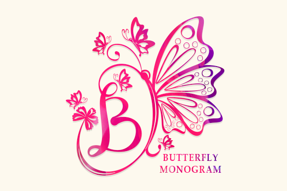
Butterfly Monogram Font
A single decorative accent for initials and seals
Editorial font inspiration
Seller-provided type specimen, not a Photoshop test screenshot
Butterfly Monogram is a decorative font whose listing describes ornamental letterforms. Unlike the other examples, its best role is narrow: an initial, monogram, or emblem on the back of an invitation, an envelope seal graphic, or a small decorative corner. It offers a contrasting illustration-like feature rather than another flowing script that competes with the couple's names.
Use it as one separate type layer and check which characters the actual font maps to particular ornaments. Do not expect a decorative monogram alphabet to perform like a paragraph font or to deliver legible venue directions. Monogram forms can also be easy to confuse, so make sure the intended initials are unmistakable. A restrained serif for the remaining invitation will keep the decorative seal from taking over the page. The listing is evidence of the decorative category, not proof of a specific embedded glyph or output format.
Check exact font files and license before use.
For an invitation that mixes several types of text, begin with the supporting typeface and read the whole card at actual size. Reserve the display line for decoration; keep the date, location, and RSVP instructions easy to find.
How to Choose and Pair Wedding Fonts in Photoshop
Match the Font to Your Wedding Aesthetic
A formal reception often suits a quiet serif with restrained calligraphy for the names. A garden wedding can accommodate looser brushlike lettering, provided the rest of the invitation stays orderly. A modern city celebration may need no script at all; a bold name line and balanced sans-serif body can feel appropriately contemporary. Rustic and bohemian invitations benefit from a relaxed handwritten element, while overly distressed or decorative faces can become tiring in long blocks of copy.
Before choosing a font, describe the wedding in a few plain words: intimate, formal, playful, or outdoors. Choose a font that supports that description instead of forcing the whole invitation to conform to a font specimen. If the design includes abundant flowers or a patterned border, the typography may need to become simpler.
Pair Decorative Script with Readable Text
Two compatible roles are usually enough: expressive display lettering for names, followed by a readable serif or sans serif for practical text. You can introduce size, spacing, and weight changes within those families instead of buying a third or fourth decorative font. Create separate type layers for headlines, dates, venue lines, and RSVP instructions; that makes it easy to rebalance the design without changing every instance by hand.
Avoid Common Readability Problems
Read the venue address aloud from an actual-size proof. If a guest has to decipher a lowercase r or distinguish a numeral from a letter, the font is working against the invitation. Small text also needs enough contrast against cream or tinted backgrounds. Watch where swashes end: a flourish shouldn’t intersect an ampersand, divider, or neighboring letter. Finally, leave margins wide enough that no names look cramped after trimming.
| Wedding style | Display lettering | Supporting text | Good application |
|---|---|---|---|
| Traditional formal | Restrained calligraphy | Classic serif | Couple names and ceremony details |
| Contemporary | Bold sans or modern serif | Light sans | Minimal city invitation |
| Garden romantic | Soft handwritten script | Readable serif | Names with floral illustration |
| Bohemian | Relaxed brush calligraphy | Simple sans | Save-the-date and welcome card |
| Monogram-led | Decorative initial | Quiet serif or sans | Envelope motif, RSVP card |
Photoshop Typography Tips for Wedding Stationery
Before adding effects, correct the letter spacing. The distance between a capital and the following lowercase character can make a couple’s name feel either composed or strangely broken. Use tracking for whole phrases and kerning for individual pairs. A short uppercase date line often benefits from slightly more tracking; small paragraphs may need less. Avoid setting every line to the same exact width simply because center alignment makes it easy.
Use a limited color palette: one main text color, perhaps a restrained accent, and a background that provides dependable contrast. Save extra flourishes for the title or monogram. A subtle layer style can work when the background is busy, but thick outlines and strong drop shadows frequently make thin serif details less clear. Duplicate any type layer before applying a destructive effect. Check the invitation at the size and distance at which a guest will actually read it.
Why Is My Wedding Font Not Showing in Photoshop?
The Installed Font Does Not Appear
First verify you installed the font file itself, not the ZIP or a preview image. On Windows, check the system’s installed fonts; on macOS, check Font Book. Close and reopen Photoshop if you installed the typeface while it was already running. Search for the internal family name, which may differ from the marketing title. If the download contains several related files, confirm you installed the style you are trying to select.
Decorative Swashes or Alternate Characters Are Missing
Make sure the seller actually documents those extras. Try Photoshop’s Glyphs panel with a text cursor in the correct type layer; examine the selected font’s available characters. For OpenType-specific alternatives, check the Character panel’s OpenType options. A flattened specimen image cannot reveal how the font maps every swash. You may need the product’s character map or readme to find particular PUA characters.
The Font Looks Different from the Preview
Seller previews use carefully selected phrases, spacing, colors, and glyph alternatives. Your names may not naturally contain the same decorative letters. Set a phrase in plain text first, then compare the specific alternate characters that are actually included. Avoid assuming a vendor’s floral illustration or textured background is built into the typeface.
The Font Changes When Opening a PSD File
A collaborator may not have that font on their computer. Adobe’s current missing-font help describes Type > Manage Missing Fonts for unavailable non-Adobe typefaces. Adobe Fonts families may be activated through Creative Cloud, but third-party files need their own legitimate installations. Do not send raw commercial font files to collaborators unless your license permits it. If someone must edit the wording, coordinate their access to the correct licensed family before a PSD handoff.
Try a new PSD with one short text layer. If the font works there but appears wrong in the invitation, investigate the type layer’s selected style, glyphs, and inherited formatting before reinstalling anything.
Preparing Wedding Typography for Print or Digital Sharing
Check the entire design at the intended final dimensions. A page that looks spacious on a large monitor can become crowded on a 5-by-7 card; a digital invitation needs legible type on a phone without a zoom gesture. Inspect thin serif strokes and loose calligraphy joins particularly carefully. Keep important words comfortably inside the printer’s safe area rather than aligning them to the exact trimmed edge.
For professional printing, ask your printer about finished dimensions, bleed, color profile, resolution, and file format before export. A common starting point for close-viewed paper artwork is 300 pixels per inch, but the provider may ask for a different specification. Photoshop’s resolution controls do not create genuine detail merely because you increase the number. Avoid flattening your only copy: keep an editable PSD and export a separate delivery file. For digital stationery, view the export on a phone and a computer. Check the date, address, and any unusual symbols.
Frequently Asked Questions About Wedding Fonts for Photoshop
How do I install wedding fonts in Photoshop?
Extract the purchased or downloaded archive, install the .otf or .ttf font in Windows or macOS, then open Photoshop desktop. Choose the Type Tool and locate the installed family in the font menu. If the font does not appear, restart Photoshop and search for its internal family name.
Can I use Creative Fabrica fonts in Photoshop?
Many Creative Fabrica font listings are intended for use in desktop programs that accept installed system fonts. The actual download must contain an appropriate installable font, and your intended project must satisfy the license attached to that download. A marketplace compatibility badge alone does not establish how every glyph will render.
Why is my downloaded font not appearing in Photoshop?
A ZIP may not have been extracted, the font file may not have been installed, Photoshop may have remained open during installation, or the family may appear under a different name. First check installation in the operating system and then reopen Photoshop. For a shared PSD with unavailable typefaces, inspect Type > Manage Missing Fonts.
What font styles are best for wedding invitations?
For formal stationery, a legible serif with a restrained script accent works well. Modern layouts often pair a strong serif headline with a plain sans serif. Rustic or relaxed invitations can use softer handwritten names, with practical information set in clear supporting type.
How do I use calligraphy swashes in Photoshop?
Check that the font actually includes swashes. Open Window > Glyphs and inspect available characters for the active type layer, or explore supported OpenType options in the Character panel. Only insert the characters supplied by that particular font; not all script faces include the same alternates.
Can I combine two fonts in one wedding invitation?
Yes. Using separate editable type layers makes this straightforward. Put couple names in a display face and date, venue, and RSVP details in a readable serif or sans serif. A difference in role, size, or weight usually creates more effective hierarchy than stacking several elaborate scripts.
Can I sell wedding invitations made with downloaded fonts?
That depends on the font’s actual license, how it was purchased or downloaded, and how you deliver the finished product. Creative Fabrica describes permitted physical and digital end products under conditions but restricts redistribution of raw font files and certain embedding uses. Check the current terms and do not assume that a design template can include editable/extractable source font files.
Final Thoughts: Creating Wedding Typography in Photoshop
Download an installable font, add it through Windows or macOS, build the invitation with editable type layers, and refine spacing before applying decorative effects. Give the couple’s names personality while keeping times, dates, and venue information easy to understand. For a formal layout, try a restrained serif; for a garden card, a gentle calligraphy heading may feel more natural. The featured fonts offer examples of these different roles, but no purchase is necessary to practice the process. Keep an editable PSD and inspect a full-size proof before delivering the file in the printer’s requested format.