
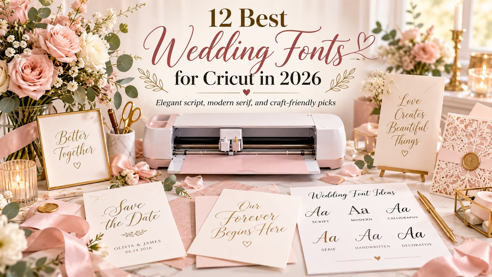
Wedding fonts for Cricut have two jobs: look right for your celebration and suit the way you will actually make the design. A delicate script that looks beautiful printed on an invitation can leave frustratingly small pieces when cut in vinyl. The same decorative font may produce hollow outlines when drawn with a Cricut pen. A font preview won’t tell you how either operation will behave.
For a welcome board, you may want sweeping names that guests can spot across the room. A favor label needs compact, readable text. A pen-addressed place card calls for a writing-style font or a carefully considered alternative; a printable invitation offers more freedom for thin calligraphy. Project, material, and lettering size should guide the choice.
These twelve picks come from fifty Creative Fabrica listings. The range runs from romantic scripts to practical duos, a minimalist sans, a formal serif, and an ornamental monogram. Each review explains where the typeface may belong in a wedding design and where caution is sensible. None is presented as hardware-tested or certified for every Cricut operation.
Our Top Cricut Wedding Font Picks at a Glance
Best romantic script
Maddison Font
Expressive calligraphy for couple names, especially where the lettering can stay large.
Best coordinated duo
Pink Vibes Duo Font
The listed script and sans serif give names and event details different jobs.
Best clean support type
Minimalist Font
A restrained sans serif for labels, dates, table details, and modern signage.
Best formal non-script
Ethereal Font
A multiweight serif option for an editorial invitation or table-number look.
Compare the 12 Best Wedding Fonts for Cricut
These are suggested design uses, not cutter-performance certifications. Match the choice to the smallest and most demanding item you plan to make.
| Font | Style | Best wedding project | Important consideration | Listing |
|---|---|---|---|---|
| Maddison Font | Romantic script | couple names on invitation covers and medium-size decals | swash and varied baseline can complicate very small vinyl | View font ↗ |
| Pink Vibes Duo Font | Script / sans duo | matched invitation headlines and supporting text | included styles do not guarantee identical cut behavior | View font ↗ |
| Minimalist Font | Minimalist sans serif | sign directions, date lines, table labels | not a decorative script; avoid using as only expressive headline | View font ↗ |
| Thick Black Font | Soft decorative display | large, gentle letterforms for short signage | font name is not evidence of thick-stroke geometry or easy weeding | View font ↗ |
| Farmhouse Font | Bouncy swash script | farmhouse welcome signs and rustic gift labels | swashes need extra negative space at small sizes | View font ↗ |
| Gastonia Script Font | Modern calligraphy | large ceremony names and welcome boards | flowing calligraphy can have fine joins and narrow spaces | View font ↗ |
| Ethereal Font | Multiweight serif | formal table numbers and printed invitations | hairline contrast of serifs may be fragile in tiny cuts | View font ↗ |
| Brown Carolina Duo Font | Sans / script duo | a contemporary ceremony sign paired with readable sans text | the duo components still require individual size and font tests | View font ↗ |
| Baby Boho Font | Casual boho script | garden or boho wedding welcome signage | long swashes may extend beyond a compact decal | View font ↗ |
| Butterfly Monogram Font | Ornamental monogram | couple monogram accents on bags and favor packaging | ornaments can be too intricate for small adhesive labels | View font ↗ |
| Ashley Marie Font | Script / sans duo | cohesive gift labels and wedding weekend tote designs | pairing feature says nothing about native writing font support | View font ↗ |
| Lightning Script Font | Handwritten script | simple handwritten phrases for accent signage | handwriting specimen does not establish cut-safe stroke width | View font ↗ |
The 12 Best Wedding Fonts for Cricut in 2026
1. Maddison Font
Best romantic calligraphy
Romantic script
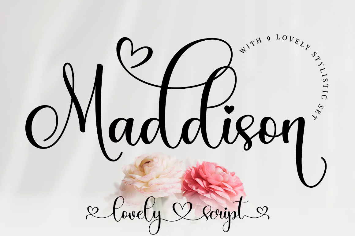
Maddison gives names the slightly unsettled rhythm of hand lettering. The seller describes it as romantic calligraphy with characters that move along the baseline, so it belongs on a wedding piece where the names deserve attention. Think of a large paper invitation cover, a keepsake box bearing the couple's surname, or a short phrase on a welcome board. That slight irregularity suits a personal invitation.
The listing specifically mentions PUA encoding for accessing glyphs and swashes. Use those optional characters sparingly. A single extended capital can make a larger name look considered; several flourishes in a line may compete with the words. Put venue directions and times in a plain supporting font so readers do not have to interpret the decorative lettering.
For cut vinyl, zoom in on where adjoining letters meet. A slender join or a flourish that curls back near another stroke deserves a trial cut at the actual size. The preview cannot tell us whether your adhesive material will weed cleanly. Maddison looks most comfortable when the lettering has room.
Listing details and license subject to seller terms.
2. Pink Vibes Duo Font
Best script-and-sans pairing
Script / sans duo
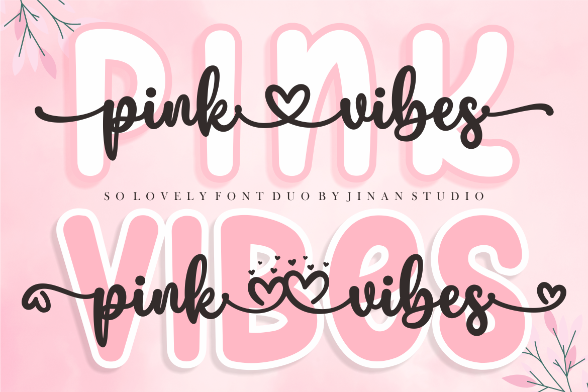
Pink Vibes Duo addresses a layout problem that arrives early in wedding planning: the script is lovely, but the date and address need a quieter voice. Its seller identifies two styles, script and sans serif, supplied as a duo. It offers a ready starting point for matching invitations and favor tags.
Set the couple's names in the expressive half and reserve the sans serif for the ceremony time, RSVP instructions, or a bar-menu item list. On a welcome sign, the contrast can make the heading noticeable without forcing every guest to decipher cursive from several steps away. The seller also describes PUA-accessible glyphs, so decorative alternates may be available in the downloaded package; check the actual files and your design software before committing to a particular character.
Each of the two styles still needs its own cutting trial. Each has its own outlines and, potentially, tight interior spaces. Print a proof for stationery and cut a sample for vinyl. Choose this pair when consistency across different wedding pieces matters more than elaborate calligraphy alone.
Listing details and license subject to seller terms.
3. Minimalist Font
Best minimalist supporting font
Minimalist sans serif
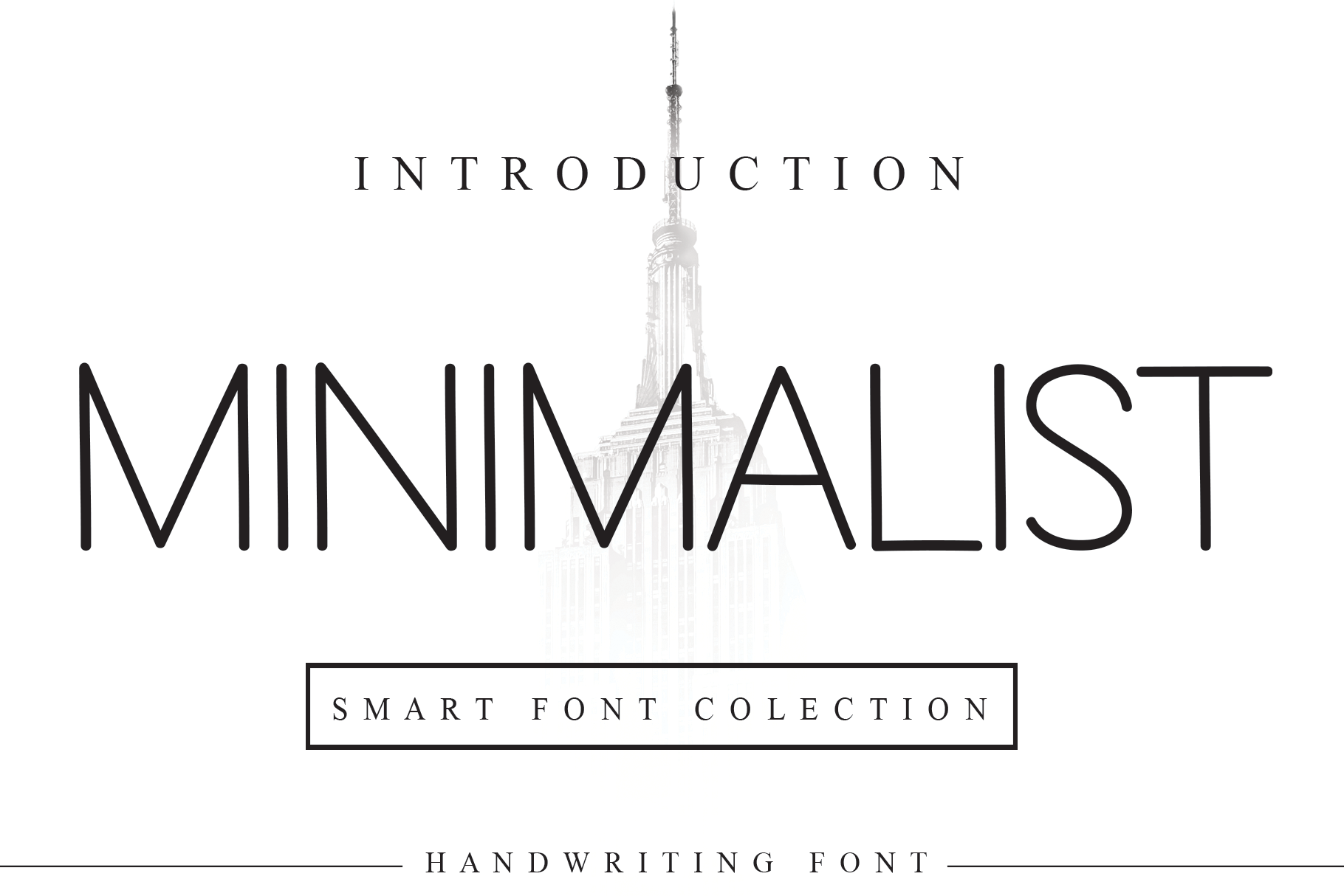
Minimalist is the deliberate quiet spot in this selection. The seller calls it a neat sans serif, and that description gives it a straightforward role: information. Table assignments, an unplugged-ceremony notice, wedding website URLs, favor ingredients, and names on narrow labels all benefit from letters that are less ornamental than an elaborate script. For a modern wedding, it could carry the full design.
A modern sign can use a large all-caps heading with comfortable tracking, followed by a smaller line that guests read quickly. A restrained face like Minimalist is also useful as a companion to Maddison or Gastonia Script. Keep the support type large enough for the final material; a narrow name card gives you less margin for tiny counters than a sheet of printed paper does.
Simple-looking letterforms still require checks. We have not measured this font's stroke widths or tested its cuts, and a tiny vinyl label might fail even when the overall design seems uncomplicated. Its limitation is stylistic rather than technical: couples wanting decorative handwritten romance may find it too reserved as their only wedding font.
Listing details and license subject to seller terms.
4. Thick Black Font
Best soft statement lettering
Soft decorative display
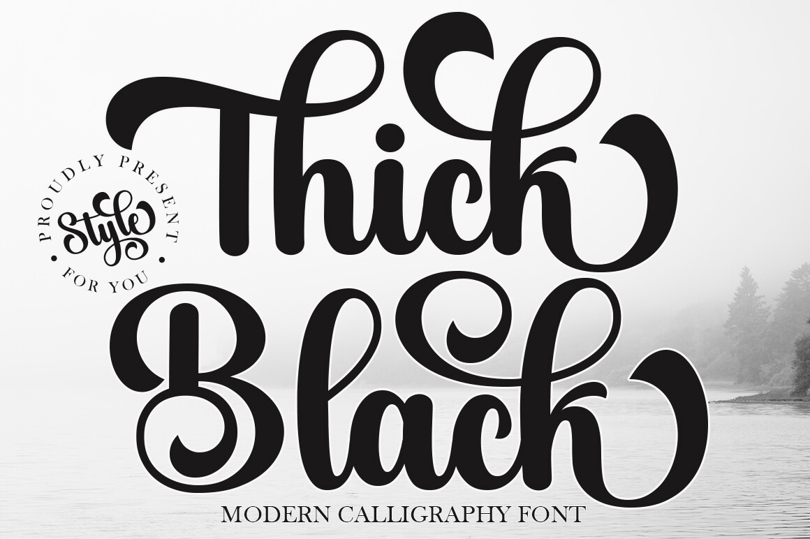
The name Thick Black sounds as though it promises a heavy weight. The seller's description actually emphasizes softness, graceful strokes, and a feminine feel, with weddings, signs, invitations, and labels among suggested uses. Check the specimen rather than assuming the name describes its actual stroke weight. For this roundup, its proposed role is a gentle statement font.
Picture a short 'Welcome' on a reception sign or the newlyweds' shared name on a keepsake case. Pair the expressive heading with restrained text for arrows, times, and seating instructions. The result should feel approachable rather than ceremonial. Because the seller does not provide verified cutter-performance measurements in our source sheet, calling the strokes 'easy to weed' would be a guess.
Before buying for a small decal project, inspect the actual alphabet preview and try the narrowest letters at intended size after installation. Treat decorative curls as optional rather than mandatory. Thick Black is included for its soft, wedding-appropriate character, not because its name guarantees robust cutting geometry. For a reception sign, test capital letters as well as the lowercase text; their proportions can change how the entire design reads.
Listing details and license subject to seller terms.
5. Farmhouse Font
Best rustic farmhouse look
Bouncy swash script
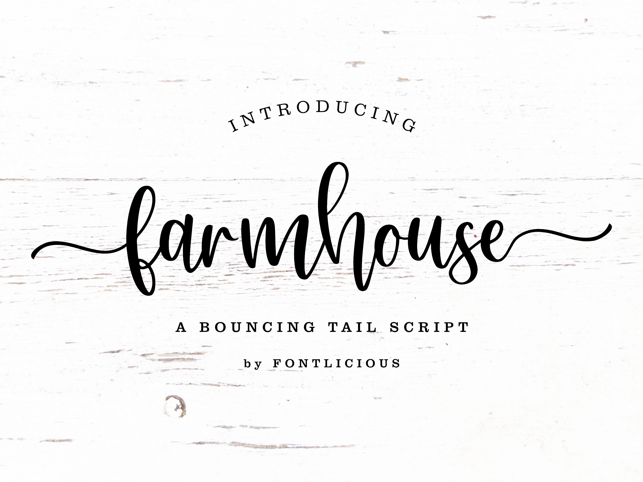
Farmhouse is the most direct choice for a barn, garden, or relaxed countryside celebration. Its seller calls it a bouncy font with swashes, meant for personalized craft projects. That informal motion can suit a wooden-look welcome board, bridesmaid gift, rustic photo backdrop, or handwritten-style seating display. It would feel less natural on a very strict black-tie invitation, which is part of what makes its niche useful.
Short phrases give a bouncy script room. 'The Martins' or 'Welcome to our wedding' can occupy generous space; a full paragraph of directions will not improve with extra flourishes. For a layered sign, consider a clean sans serif for the ceremony date and a separate Farmhouse line for the couple's name. Keep the decorative tail of a letter away from the edge of a decal.
At small sizes, those swashes may create tiny islands or narrow spaces that are hard to weed. None of those outcomes has been tested for this product here. A trial cut on scrap material is the deciding step before ordering enough vinyl for all the favors.
Listing details and license subject to seller terms.
6. Gastonia Script Font
Best luxury-style headline
Modern calligraphy
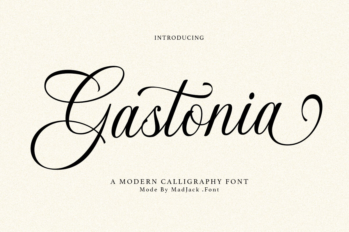
Gastonia Script is suited to wedding lettering that wants a formal entrance. Creative Fabrica describes it as modern calligraphy with flowing strokes, graceful curves, and a polished feel. It makes sense on a large ceremony sign or seating-chart headline. Use it where the couple's name is allowed to have its own space rather than being squeezed into a dense instruction block.
Consider the hierarchy on a welcome board: names in Gastonia, a small uncomplicated line for the date, and a readable sans serif for any directions. The contrast allows the calligraphy to remain expressive while everything practical stays easy to read. The recommendation rests on its formal character, not on verified Cricut engineering.
Flowing strokes and dramatic curves need inspection at final size. Depending on the font outlines, a capital or connecting line may create narrow vinyl sections. The source information does not establish an appropriate minimum cut height, and no machine test was conducted. Choose Gastonia for spacious signage or printed headlines, then prove its suitability for your exact cutting material before producing duplicates. Keep an unmodified copy of your text before permanently merging the cut paths.
Listing details and license subject to seller terms.
7. Ethereal Font
Best elegant serif
Multiweight serif
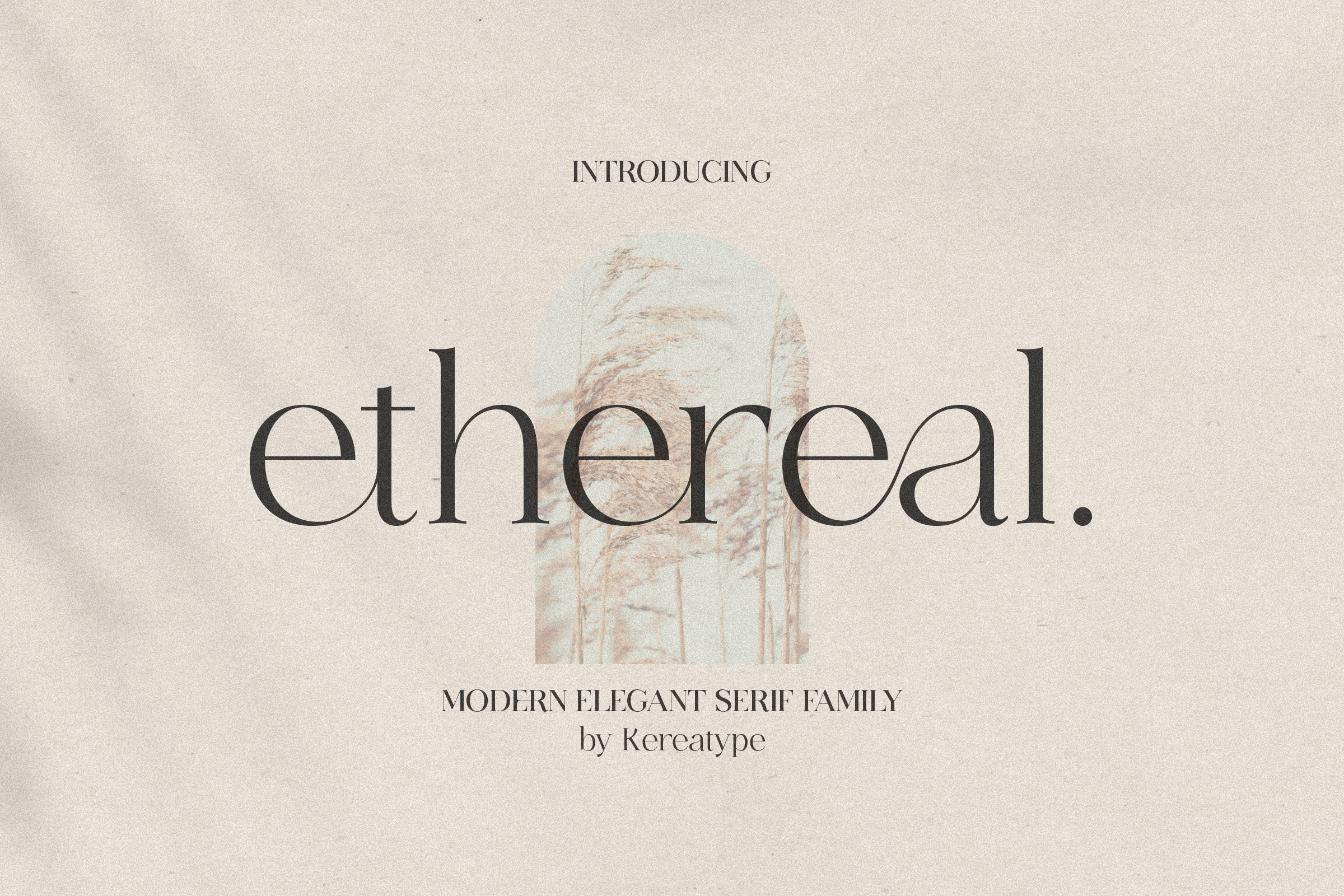
Ethereal introduces something that many wedding-font lists underuse: a serif family. Its seller calls it an elegant, modern serif with multiple weights and decorative extras. It offers a quieter option among so many scripts. Consider it for an editorial-style invitation, a table number, an order-of-events card, or a formal title paired with modest supporting copy.
Multiple weights are particularly interesting because a design may need both a prominent number and a lighter secondary line. Check which weight files the download actually includes and whether the decorative options are accessible in your application. A typeset invitation can make the most of a finer serif; a vinyl cut asks a different question, because the smallest serif tips must survive weeding.
Printed stationery and larger text give Ethereal more room to work. At small adhesive sizes, high-contrast strokes and serif details can be more delicate than they appear on screen. We did not test Ethereal with a blade or measure its paths, so the advice is conditional. Its strength in this list is a formal, non-script alternative.
Listing details and license subject to seller terms.
8. Brown Carolina Duo Font
Best modern boho duo
Sans / script duo
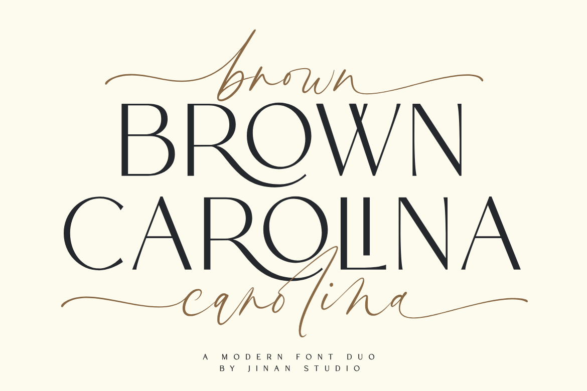
Brown Carolina Duo is a practical choice for a wedding style that sits between urban modern and casual handwritten. The seller describes a paired contemporary sans serif and script. The two styles already have different jobs. Use the script for the couple's names on a ceremony sign, and the sans serif for location, date, and short instructions.
Unlike a pairing built around two ornate scripts, this combination offers a natural place to put the information that guests must read quickly. For a weekend itinerary or a group of gift labels, you can repeat the same two roles without changing the overall identity. It can also suit a restrained boho design.
Duo formats save pairing decisions, not cutting trials. The script may contain overlapping paths and the sans lettering may have narrow counters at small scale. Their behavior cannot be certified from the seller prose alone. When possible, lay out the longest guest name and the smallest caption at true scale, then cut those two difficult examples before committing to a full set.
Listing details and license subject to seller terms.
9. Baby Boho Font
Best laid-back bohemian script
Casual boho script
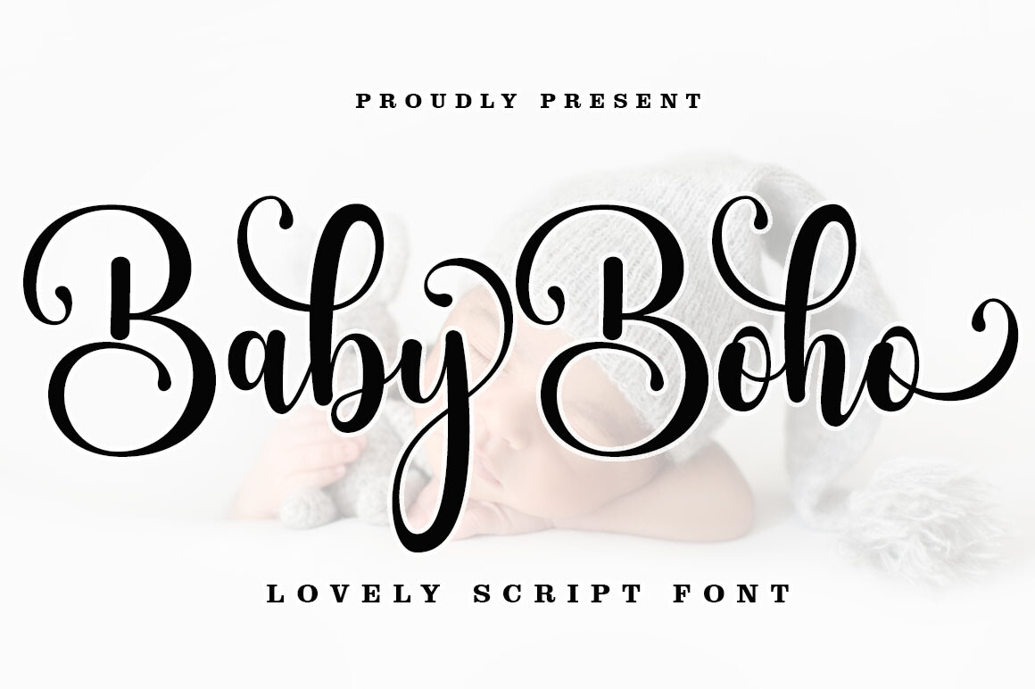
Baby Boho takes a looser approach than formal invitation scripts. Its listing calls it a casual modern-calligraphy style with swashes and describes uses that include wedding invitations, signage, labels, and packaging. Consider it for garden weddings, personalized welcome signs, or relaxed favors. It has a more casual mood than formal engraving-style lettering.
One short line of Baby Boho can carry personality on a sign, while a plain typeface handles the practical details underneath. If you use the swashes, place the full phrase on the actual sign dimensions in Design Space before committing. A looping descender that looks beautiful in a sample image may crowd an adjacent line on a narrow wooden sign.
The listing’s ‘Regular’ style does not mean Cricut Writing style. Standard outline fonts commonly produce outlined letters with pens. For vinyl, inspect letter joins and cut a sample on your chosen material. Baby Boho earns its place for a relaxed aesthetic; fine flourishes remain a potential small-scale drawback. A short phrase on a larger favor box may be a better first experiment than dozens of tiny stickers.
Listing details and license subject to seller terms.
10. Butterfly Monogram Font
Best decorative initials
Ornamental monogram
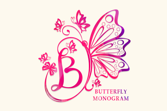
Butterfly Monogram is not trying to solve the same task as the other eleven fonts. The seller describes it as an ornamental decorative alphabet, with weddings and stationery among its suggested uses. Its best role is a single initial or a very short monogram, perhaps on a welcome sign, favor bag, gift box, or the cover of a guest book. Use the initial as a recurring identity mark.
Try repeating that motif across three pieces: an invitation seal, the seating chart header, and a keepsake tag. That repetition links the pieces while readable fonts handle directions and addresses. Pair it with a spare serif or sans serif for dates and any text longer than one or two words. This product is included for ornamental use, not conventional paragraph typesetting.
Ornaments bring extra internal gaps and possible thin sections, depending on which glyph you choose. Tiny vinyl monograms are therefore the first thing to trial, never an assumed safe use. We have not assessed the supplied outlines or the glyphs' true width in millimeters. For a small cut, enlarge or simplify the application rather than expecting every flourish to survive.
Listing details and license subject to seller terms.
11. Ashley Marie Font
Best playful matching duo
Script / sans duo
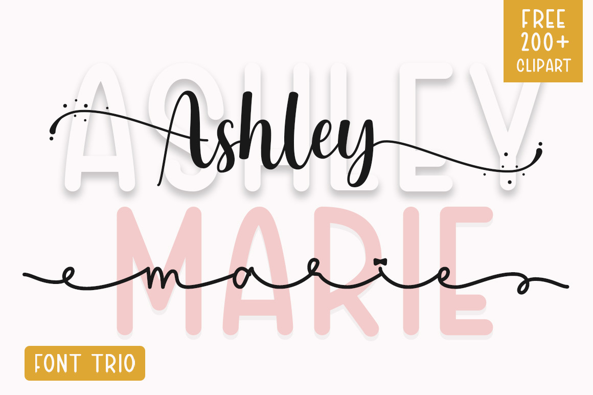
Ashley Marie is another seller-described duo, combining script and sans serif, but its role is softer and more playful than a high-formality pair. It is easy to imagine on a bridal-party gift tag, a wedding weekend tote, or a set of favor labels. The script can provide the warm name line while the simpler partner keeps room assignments, dates, or flavors unobtrusive.
A duo helps connect several different wedding objects visually. You can put a name in the expressive component on a tote and reuse the sans serif for smaller printed labels, creating a family resemblance without repeating an identical design. The product listing describes broad versatility but does not provide the kind of reproducible vinyl trials that would establish how small either style can cut.
For adhesive lettering, begin with the smallest planned favor tag. A confident-looking large sign tells you little about a one-inch word. If the script's turns become too tight, enlarge it or switch the small detail to the companion sans. Ashley Marie deserves a look when the wedding includes personalized gifts; it is less suited to pages of body copy.
Listing details and license subject to seller terms.
12. Lightning Script Font
Best bold handwritten accent
Handwritten script
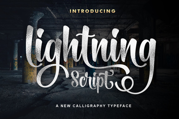
Lightning Script is a handwritten face that the seller recommends for signs, invitations, business cards, and other personal designs. In a wedding context, it suits a short vow-book title, a meaningful phrase on a backdrop, or the newlyweds' names on a gift. The appeal is the immediate handmade impression. Use it when you want the sign to resemble a handwritten note.
Lightning is a casual alternative to the formal calligraphy picks. Keep the phrase brief and let the composition do the work. A single sentiment above a plain date often looks more intentional than a long message set entirely in decorative writing. For a printed card, test the line at final size for legibility before sending a batch to the printer.
The listing is not evidence that every curve and internal space will survive vinyl cutting or that the font produces one-line pen writing. If you intend to use it with a blade, inspect the smallest joints and cut an actual-size sample. Choose it for expressive short copy, while using a quieter font for anything guests must read rapidly.
Listing details and license subject to seller terms.
How to Choose the Best Wedding Fonts for Cricut Projects
Choose fonts based on your Cricut project
Begin with the object, not the alphabet preview. Large vinyl wedding signs give script flourishes room to breathe. Tiny favor labels offer almost none. Invitations printed on paper can reproduce delicate curves that would be difficult to lift from cut vinyl. A wedding place card made with a pen raises a separate requirement: whether the chosen typeface has appropriate writing paths. Decide first whether you are cutting solid letters, drawing strokes, or printing artwork and cutting its outer shape. A printed invitation can carry a detailed script in the names, while a cut-cardstock insert might work better with broader strokes. Favor-tag labels are especially unforgiving when you reduce the artwork to fit a narrow surface.
Understand script fonts and connected letters
Decorative script often looks like one flowing word, yet individual character outlines may overlap. Preview the cut result, especially where lower-case characters touch. Cricut’s Combine guidance explains that Unite merges shapes while keeping components editable, whereas Weld permanently combines overlapping shapes into a single layer. Use whichever action is appropriate for the artwork; do not weld before checking spelling or spacing.
Consider cutting and weeding difficulty
Judge the narrowest part of a letter, not its average size. Very thin joins, tiny counters, tight loops, and decorative tails can create material that tears or lifts during weeding. A useful practice is to cut one difficult guest name at the exact final scale on a scrap of your intended vinyl. If the narrow strokes fail, enlarge the lettering, choose a simpler typeface, or use a printed method. There is no reliable universal minimum letter height in this article because materials, machines, and outlines vary. Transfer tape also matters; test with your intended material.
For a dozen favor decals, first cut the longest name with the smallest counters at the size it will appear on the finished item. A successful 20-inch welcome sign is not proof that the same font works on a two-inch label.
Prioritize readability for wedding signs
Your welcome sign may be read from several feet away while guests are moving. Reserve elaborate calligraphy for names, a short greeting, or a single line. Use clear lettering for the date, directions, and seating instructions. Test contrast on the actual surface: pale lettering on a reflective acrylic board may disappear under venue lighting. A printed proof at realistic viewing distance can catch these problems before you prepare vinyl. Ask someone to locate the venue and time quickly on a proof.
Check font formats and licensing
Check whether the downloaded package provides a system-installable font and whether your device supports its included format. Seller mentions of PUA glyphs mean decorative characters may exist; they do not promise that every alternate appears automatically in Design Space. Commercial projects require careful license review. Creative Fabrica publishes subscription and single-sale terms with different implications for future new designs, physical products, digital templates, and redistribution. Never redistribute the font file itself without permission.
How to Use Downloaded Wedding Fonts in Cricut Design Space
Check the font’s product description and package contents before installing it. On a supported desktop system, download and extract the archive, then install the provided font file using the operating system’s font manager. Close and reopen Design Space if your new font is not visible. In the Text tool, browse the font picker and look among fonts installed on your device, often described as system fonts. Cricut distinguishes system and Cricut fonts in its current Working with Text guide.
Type the actual names or phrase before judging the design. Look for odd spacing, overlapping flourishes, and narrow enclosed areas. Where separately positioned script outlines overlap, consider Combine > Unite if you want an editable merged result or Combine > Weld when the final permanent shape is ready. Keep a duplicate of any editable artwork before permanent changes. The current desktop and mobile interfaces differ, so follow the official guide for your platform.
Set the operation for the project you are actually making. Basic Cut traces cutting paths. Draw with a pen needs proper writing-style content for true single-line strokes; a normal outline font may produce hollow letters. Print Then Cut prints the artwork before the machine follows registration marks to cut, as detailed in Cricut’s Print Then Cut documentation. On a phone or tablet, installation and font availability depend on that platform; check the specific device workflow rather than assuming desktop steps transfer unchanged. Finally, cut or print a scaled test before batch production. Save an editable project version with your original spelling and spacing so you can adjust the layout without rebuilding already merged lettering.
Wedding Font Pairing Ideas for Cricut Projects
Pair decorative lettering with a simpler font for essential details. Put a romantic script on names, a serif on a formal date, or a plain sans serif on a long seating list. Using both deliberately usually works better than pairing two competing scripts.
| Wedding mood | Display lettering | Supporting type | Suggested application |
|---|---|---|---|
| Romantic garden | Maddison script | Minimalist sans serif | Couple names with clear venue details |
| Modern minimal | Ethereal serif headline | Minimalist sans serif | Welcome sign and seating chart |
| Relaxed boho | Baby Boho script | Plain sans from a verified pair | Favor tags and welcome boards |
| Coordinated weekend | Pink Vibes Duo script | Its companion sans serif | Invitations, menus, bridal-party labels |
These are visual pairing ideas, not verified claims about installed glyph metrics or automatic joining. Vinyl may need larger lettering. Check the final specimen with your actual words, especially names with unusual letter combinations. For a seating chart, reserve scripts for headings or section labels and use the simpler type for a long alphabetical list. A bar menu can repeat the same pairing with different hierarchy: its title is decorative, but the choices should be instantly legible. On printed stationery, make sure the date stays readable at actual print size, not just enlarged on a monitor.
Common Mistakes When Choosing Wedding Fonts for Cricut
- Starting with a tiny flourish. Small vinyl favors leave little room for intricate details. Test the most complex word on scrap material, then simplify or enlarge it if needed.
- Assuming connected script is a single cut path. Check the project preview for overlapping outlines. Use Unite or Weld only after reviewing the final arrangement.
- Making the date as decorative as the names. A wedding sign needs legible logistics. Let the supporting font handle times, locations, and seat numbers.
- Expecting pen lettering from a standard cutting font. Outlined fonts may draw double-line shapes. Choose a genuine Writing style or suitable single-line source when the goal is handwritten pen strokes.
- Buying only from a pretty preview. Verify the included font files, inspect character coverage, and check your real phrase at final size before spending on materials.
- Ignoring usage rights. Physical items, digital invitations, downloadable templates, and new designs after a subscription ends can have different terms. Read the license for your purchase and use case. Keep a record of which license applied when you obtained the file.
Frequently Asked Questions About Wedding Fonts for Cricut
What are the best wedding fonts for Cricut?
Maddison and Gastonia Script suit expressive names; Pink Vibes Duo offers a matching support style, while Minimalist keeps signs readable. Your best choice also depends on whether you are cutting, drawing, or printing the letters.
Can I use Creative Fabrica fonts in Cricut Design Space?
Many downloadable font files can be installed as system fonts, but you must check the package and your device. A listing is not proof that a particular font’s alternates, writing paths, or every feature will work exactly as shown in Design Space.
Which wedding font styles are easiest for vinyl?
As a general design rule, simpler shapes with sturdy strokes and open interior spaces are easier candidates than tiny flourishes. That is not a guarantee for a particular product. Try a sample at the smallest planned scale on your actual vinyl.
Are script fonts hard to cut with Cricut?
Some are, especially when their connecting strokes are thin or enclosed spaces are tight. An elegant large script may work for a sign but be awkward for a small adhesive label. Test the most intricate word first, and inspect any overlapping outlines.
Can I use ordinary fonts with Cricut pens?
You can often select them for a Draw operation, but an ordinary outlined font may be drawn as two outlines rather than a single handwriting stroke. A genuine writing-style or single-line font better fits the single-stroke goal.
How do I make cursive letters connect in Design Space?
Check letter spacing and overlaps first. For separate shapes that need one cut silhouette, Cricut’s Combine > Unite keeps the combination editable; Combine > Weld makes a permanent merged cut layer. Some kerned text may already combine touching letters in the project preview.
Can I sell wedding items made with downloaded fonts?
That depends on your applicable license and how the final item is distributed. Creative Fabrica’s subscription and single-sales licenses discuss physical products, digital end products, and redistribution separately. Check the current license and do not distribute the original font files.
Final Thoughts on Choosing Wedding Fonts for Cricut
Choose the making method before falling for a specimen. Maddison may give printed invitations and large lettering a romantic feel; Minimalist can keep guest information readable. Pink Vibes Duo and Brown Carolina Duo help maintain a consistent look across stationery and decor, while Butterfly Monogram is best treated as a small decorative accent. Try the hardest word on your intended material at real size, and check whether the job needs cutting outlines or pen-ready writing paths. Keep the font that suits your look and produces a usable result at the size you need.