
There is no single typeface that suits every ceremony. An intimate backyard wedding calls for a different voice from a formal invitation on thick cotton stock. More importantly, a font that looks wonderful in a six-word specimen may be exhausting in a twenty-line invitation. The choices below deliberately cover different jobs, including the smaller text that many “best wedding script” roundups overlook.
For most invitation suites, start with one expressive font for names and one readable font for details. A monogram can be added as an accent, but it should never compete with the date or place. Here are our short-list choices before the full comparison.
Our Top Wedding Invitation Font Picks at a Glance
Maddison
Balanced calligraphy with accessible alternate letters for a memorable names line.
Pink Vibes Duo
A script and matching sans solve the two-font puzzle in one download.
Ethereal
A multi-weight serif family for elegant cards that avoid traditional curls.
Baby Boho
Informal calligraphy and optional swashes suit outdoor celebrations.
Compare the 10 Best Wedding Fonts
These are editorial use-case judgments, not readability test scores. The “watch out for” column is as important as the style label: it tells you which task to give a second font.
| Font | Style | Best for | Main limitation | Product |
|---|---|---|---|---|
| Maddison | Modern calligraphy | Romantic & garden weddings | Less effective for multi-line practical details. | View font → |
| Lightning Script | Handwritten script | Statement names & welcome signs | Too assertive for detailed invitation wording. | View font → |
| Pink Vibes Duo | Two-font duo | Coordinated invitation suites | The expressive script still needs selective use. | View font → |
| Welcome | Handwritten font | Classic & intimate ceremonies | Needs a simpler companion for schedules and addresses. | View font → |
| Wedding Enchanting | Decorative wedding script | Black-tie & traditional weddings | Less suited to casual ceremonies or information-dense inserts. | View font → |
| Baby Boho | Casual script with swashes | Boho, rustic & outdoor weddings | Too informal for some traditional ceremonies. | View font → |
| Ethereal | Serif family | Editorial & modern-luxury weddings | Fine details may need more generous print size. | View font → |
| Minimalist | Sans serif | Modern weddings & readable information | Less wedding-specific personality when used alone. | View font → |
| Joseph Sophia | Elegant handwritten script | Personalized name treatments | Flourishes can compete with neighboring text and margins. | View font → |
| Butterfly Monogram | Ornamental monogram font | Seals, initials & stationery accents | Not suitable for dates, names in full or long text. | View font → |
On smaller screens, scroll the table sideways to see all five columns.
The 10 Best Wedding Invitation Fonts: Detailed Reviews
Each pick has a distinct design job. The right choice depends on which part of your invitation it improves and what you need to pair with it, so read the caveats before choosing a typeface for the whole suite.
Best overall romantic calligraphy
Maddison Font
Modern calligraphy
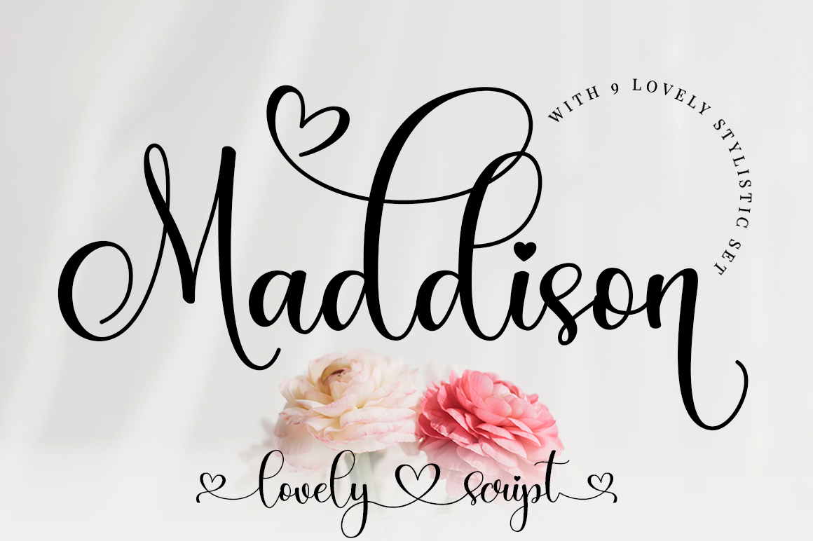
Official product preview · Image: Creative Fabrica
Maddison strikes a particularly useful balance between a handwritten mood and an invitation-ready sense of polish. The maker describes its letters as moving along a lively baseline, and that movement is exactly why it suits the line that matters most: two names set large at the top of a card.
For a garden ceremony, its easygoing curves can sit beautifully above a straightforward venue line; for an indoor evening celebration, choosing restrained ink and generous white space makes the same font feel more refined. The included PUA-encoded characters are worth exploring because a well-placed alternate at the beginning of a name can make a simple layout look custom. You do not need to decorate every letter.
Its changing baseline becomes harder to read when compressed. Keep long addresses, websites and RSVP instructions in a more regular face; check that the two names still look balanced when set together.
Why it makes the list
- Romantic without feeling excessively ceremonial
- PUA-encoded flourishes allow optional customization
- Flexible for invitation, thank-you card and signage
Consider before choosing
Less effective for multi-line practical details.
Readability: Medium for short headlines.
Check the current listing and license before use.
Best expressive signature lettering
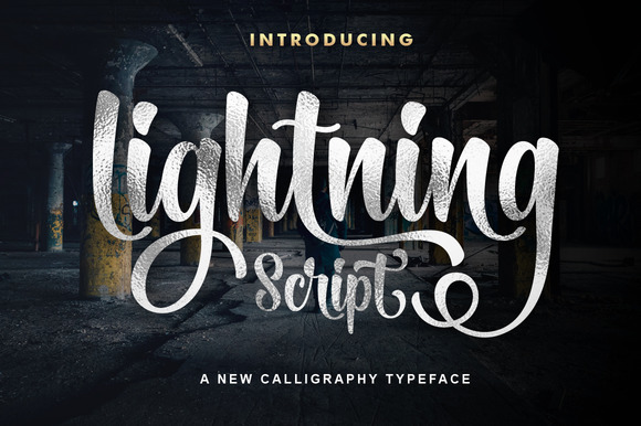
Lightning Script Font
Handwritten script
Official product preview · Image: Creative Fabrica
Lightning Script brings a confident, personal mark to wedding typography. Its most convincing role is a brief line: the couple’s names, a one-word heading, or the welcome sign guests see as they arrive. The product listing specifically positions it for invitations and signs, making it an obvious candidate when stationery must relate to event-day décor.
The character of a handwritten script is an advantage on a large invitation, where it can soften a rigid centered composition. Set the type against an uncluttered background and let a more neutral typeface handle the rest. For a contemporary wedding, pair its gesture with a geometric-looking sans rather than another swashy script. That restraint gives the lettering a reason to be expressive.
Its personality competes with long passages, particularly when every word is set in the same style. Before committing to signage or foil printing, test the specific words you need at actual size.
Why it makes the list
- Strong visual identity for names or signs
- Can tie paper goods to larger wedding décor
- Works well against simple modern layouts
Consider before choosing
Too assertive for detailed invitation wording.
Readability: Display use only.
Check the current listing and license before use.
Best ready-made script + sans pairing
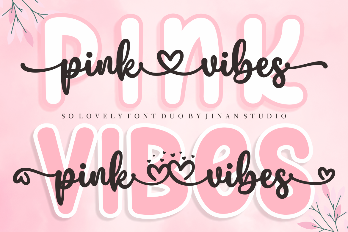
Pink Vibes Duo Font
Two-font duo
Official product preview · Image: Creative Fabrica
One of the most practical choices on this list, Pink Vibes Duo supplies both a script and a sans serif. That removes a surprising amount of guesswork. A couple planning invitations, RSVP cards, reception signs and favor labels can carry the same pair across every piece without having to browse for a matching second font.
The script introduces romance; the sans provides useful visual quiet. Treat them as different tools rather than mixing them within every line. Names, an invitation headline or a short quotation can use the script. Dates, locations, menu headings and the website address benefit from the sans. The listing also specifies PUA encoding for decorative alternatives, which can add a flourish to only the most visible part of the design.
A duo does not guarantee that every line looks good at every size. The script still needs breathing room, and small thin details need a printed proof on the chosen paper.
Why it makes the list
- Two complementary styles in one product
- Easy visual consistency across stationery
- PUA-encoded decorative options
Consider before choosing
The expressive script still needs selective use.
Readability: Versatile with role separation.
Check the current listing and license before use.
Best understated elegant handwriting
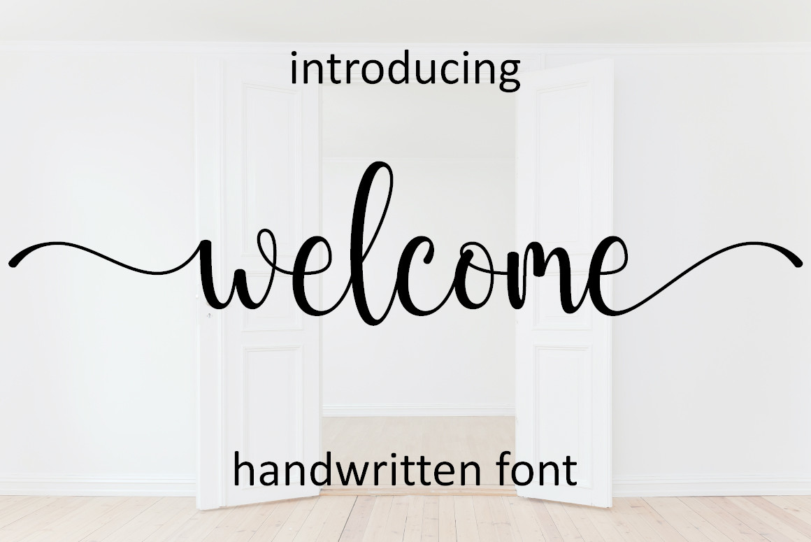
Welcome Font
Handwritten font
Official product preview · Image: Creative Fabrica
Welcome has the sort of understated handwritten character that can keep a traditional wedding invitation from feeling stiff. Its listing places it alongside wedding invitations, thank-you cards and greeting cards, so its natural territory is personal stationery rather than oversized commercial-style headlines.
Picture a small ceremony invitation on warm white stock. Welcome can take the names or a short introductory phrase while the practical information sits in a simple serif. It also offers PUA-encoded alternates, useful when one particular initial feels awkward or you want a graceful terminal on a short name. An alternate is an option, not a requirement: sometimes the default letters read more cleanly.
A handwritten style can lose its measured feel if you add too much tracking or force it into all caps. Preview the actual names and inspect how the letters connect before finalizing the layout.
Why it makes the list
- Personal, gentle editorial mood
- Useful across invites and thank-you cards
- Alternate glyphs offer modest customization
Consider before choosing
Needs a simpler companion for schedules and addresses.
Readability: Medium for short headings.
Check the current listing and license before use.
Best formal wedding-focused script
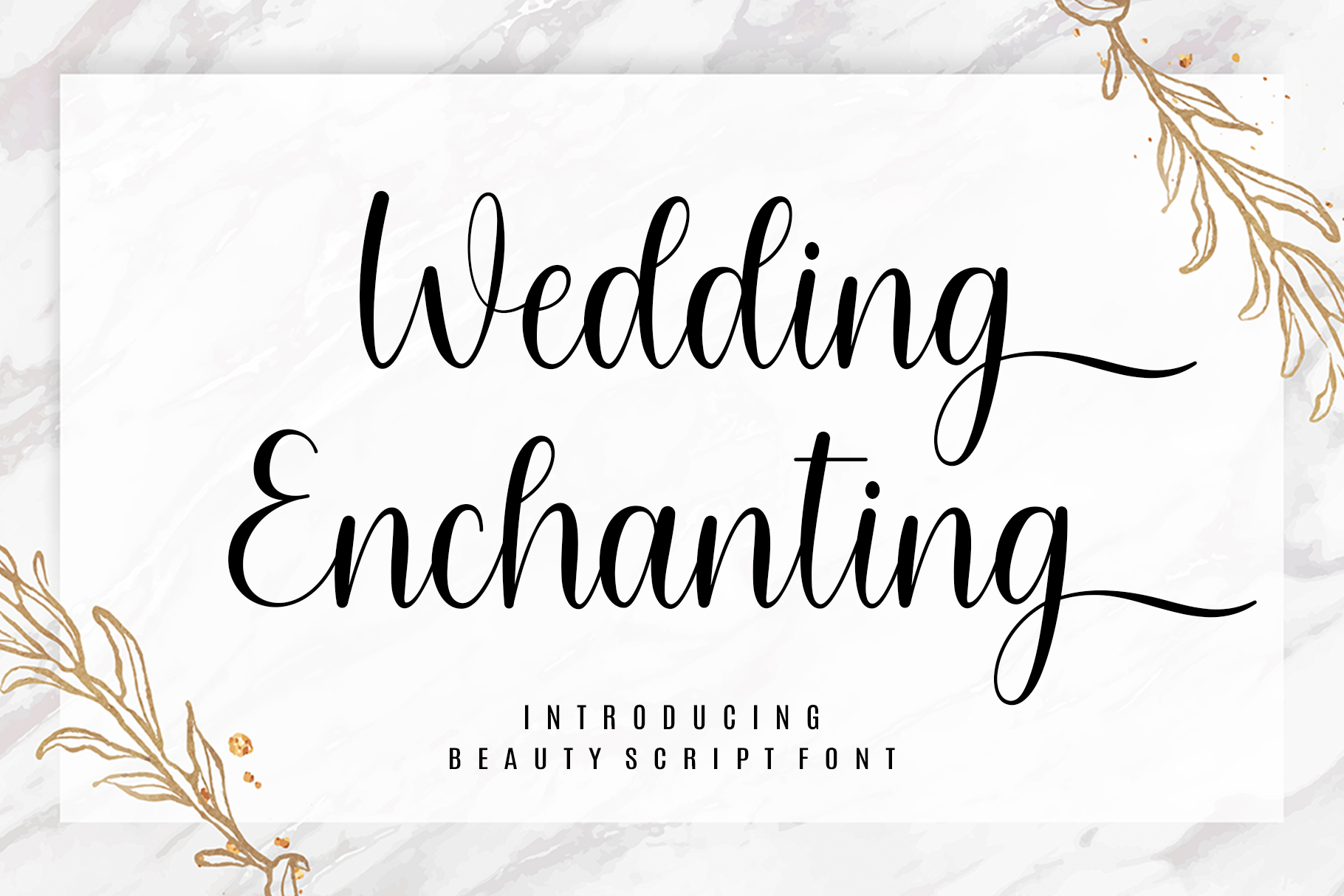
Wedding Enchanting Font
Decorative wedding script
Official product preview · Image: Creative Fabrica
Wedding Enchanting is unusually direct about its purpose: the designer describes it as a script made to complement wedding themes. That makes it a sensible candidate for couples who want typography to convey an explicitly ceremonial atmosphere rather than a relaxed handwritten note.
The best setting is a restrained, formal composition. A dramatic script can lift the names while a serif beneath provides order: date, time, location and dress code should feel calm, not equally decorative. Consider an ivory invitation with deep charcoal lettering, a slim divider and very little additional illustration. The font supplies the romantic ornament, leaving the paper and layout to supply the sense of occasion.
It is a display-led choice, so readability depends heavily on the exact names, scale and printing method. Avoid assuming that an attractive specimen means a tiny RSVP line will print clearly.
Why it makes the list
- Clear formal wedding mood
- Suitable as the focal point of a classic card
- Good contrast with understated serif text
Consider before choosing
Less suited to casual ceremonies or information-dense inserts.
Readability: Display use only.
Check the current listing and license before use.
Best boho and outdoor calligraphy
Baby Boho Font
Casual script with swashes
Official product preview · Image: Creative Fabrica
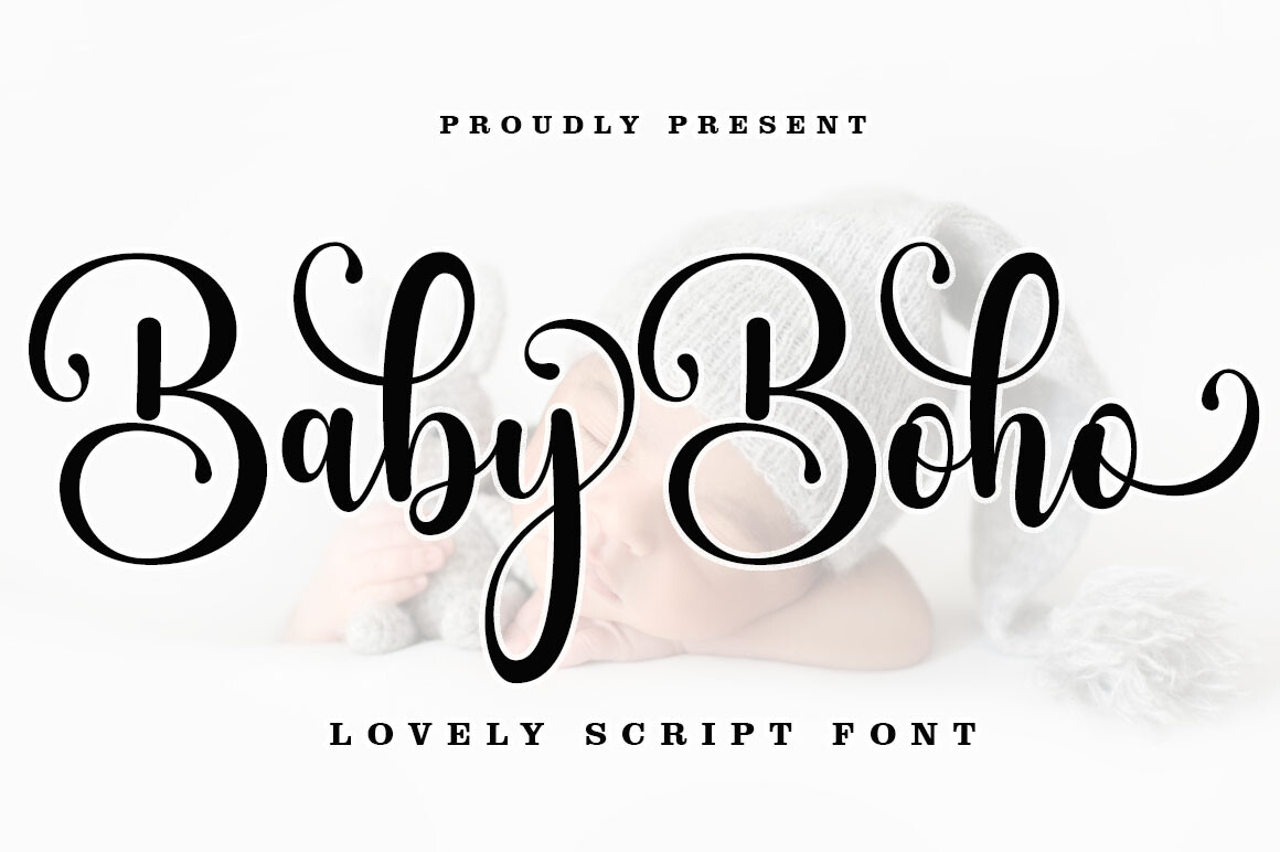
Baby Boho has a relaxed calligraphic direction suited to celebrations where the styling is deliberately less formal. The designer identifies it as a casual script with swashes and explicitly lists wedding invitations and signage among its uses. It makes an inviting alternative to the high-ceremony flourishes associated with black-tie stationery.
Think wildflower arrangements, handmade paper, warm neutrals and a reception in a garden or barn. The type can add softness without needing an extra wreath around every heading. Because the font is PUA encoded, you can choose alternate letters when the default forms look too repetitive; a single beginning or ending swash is often enough. A crisp sans underneath keeps the friendly look from becoming messy.
The casual baseline will not feel right for every event. In particular, pairing it with another quirky display face can make a carefully planned suite look inconsistent.
Why it makes the list
- Natural fit for relaxed celebrations
- Maker confirms wedding invitation and sign use
- Swashes support customized name treatment
Consider before choosing
Too informal for some traditional ceremonies.
Readability: Display use; check longer names.
Check the current listing and license before use.
Best elegant serif alternative
Ethereal Font
Serif family
Official product preview · Image: Creative Fabrica
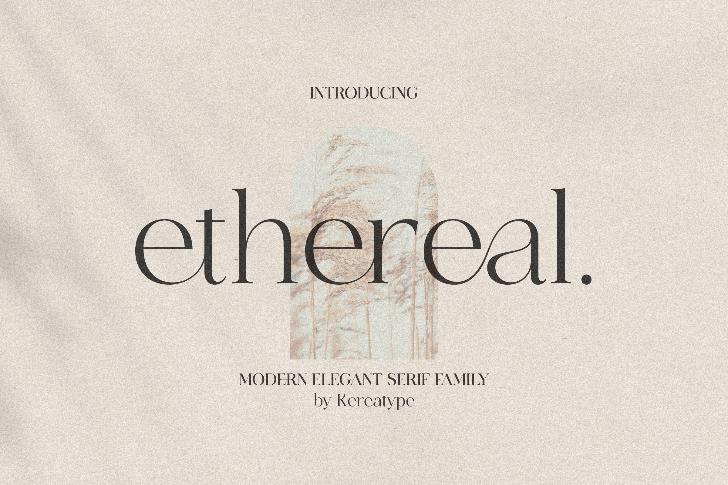
Not every wedding invitation needs flowing script. Ethereal is a modern serif family with multiple weights, according to its listing, and that makes it a welcome counterpoint to the calligraphy-heavy options in this guide. Its role can be as prominent as the couple’s names or as disciplined as the supporting information.
For a gallery-style wedding, try a dramatic serif name line, wide margins and restrained all-caps labels. For a more romantic suite, let Ethereal organize the date and venue while Maddison or Welcome handles the hero line. The availability of several weights gives you a way to establish hierarchy inside a single family without constantly switching typefaces. Check the supplied specimen and actual font files before choosing a weight for very small copy.
Some fashion-oriented serif shapes rely on delicate strokes. Those can lose definition on textured stock or at small sizes, so an attractive monitor preview does not replace a physical proof.
Why it makes the list
- An alternative to the standard wedding script
- Multiple weights permit consistent hierarchy
- Pairs with both calligraphy and clean modern layouts
Consider before choosing
Fine details may need more generous print size.
Readability: Potentially good for short body copy; proof small sizes.
Check the current listing and license before use.
Best clean font for invitation details
Minimalist Font
Sans serif
Official product preview · Image: Creative Fabrica
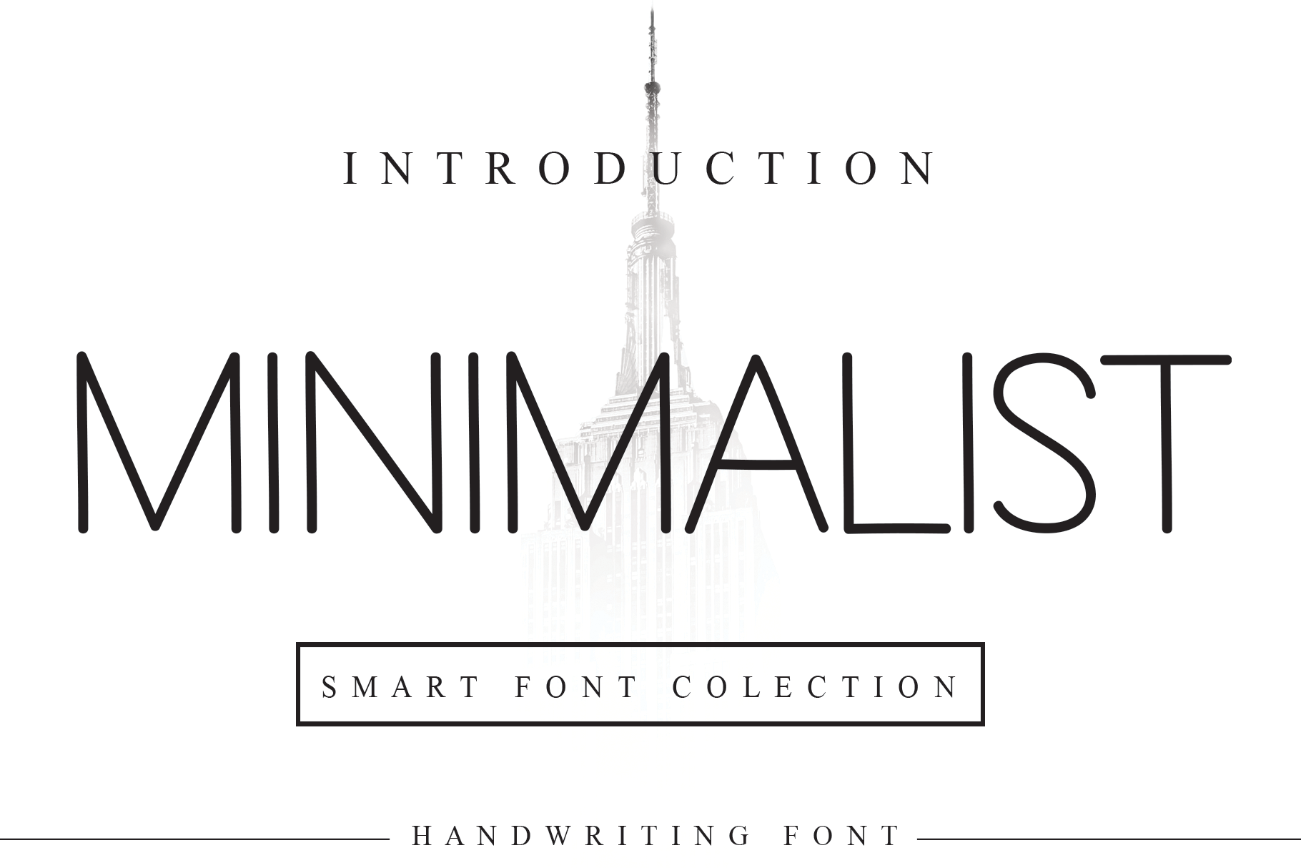
Minimalist earns a place in a wedding-font roundup by doing the less glamorous job well: creating visual order. The source describes it as a neat sans serif, and this kind of typography can be especially valuable when an invitation includes travel notes, multiple venues or an RSVP website.
It is also a defensible primary choice. A modern courthouse celebration or architectural venue may call for a spare typographic system without any flourishes. With plenty of white space and a considered type scale, a straightforward sans can feel far more intentional than a crowded decorative script. Where romance is wanted, pair Minimalist with one expressive font and let it handle everything guests must read precisely.
On its own it is less overtly romantic than the scripts above. The feeling has to come from composition, paper, color and the couple’s own wording instead of ornamental lettering.
Why it makes the list
- Practical for legible supporting information
- Useful in pared-back contemporary layouts
- Strong foil to a decorative headline
Consider before choosing
Less wedding-specific personality when used alone.
Readability: Stronger candidate for body details.
Check the current listing and license before use.
Best expressive swash customization
Joseph Sophia Font
Elegant handwritten script
Official product preview · Image: Creative Fabrica
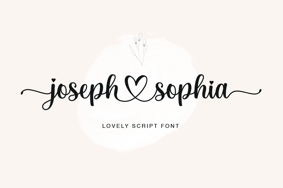
Joseph Sophia is aimed squarely at projects that benefit from an individualized handwritten touch. Its listing highlights varied baselines, smooth lines, glyph alternatives and PUA encoding. Those details matter because a script that looks ordinary in one word may become much more interesting when you can choose a more suitable initial or finish.
For a monogram-free design, the couple’s names can become the ornament. That works particularly well when the rest of the card is almost minimal: a single line of script, a small date, an understated venue line and little else. The alternates give designers room to solve awkward letter combinations or extend a flourish into an otherwise empty corner. Be selective; adding a flourish to both names can create a collision in a narrow layout.
This font has a more decorative temperament than the quiet options above. Small tracking or thick letter spacing can harm its natural rhythm; highly flourished initials need extra room near the card edge.
Why it makes the list
- Optional alternates create personalization
- Strong choice for name-led invitations
- Brings a handmade quality to coordinating paper goods
Consider before choosing
Flourishes can compete with neighboring text and margins.
Readability: Display use only.
Check the current listing and license before use.
Best decorative initials and wedding crest
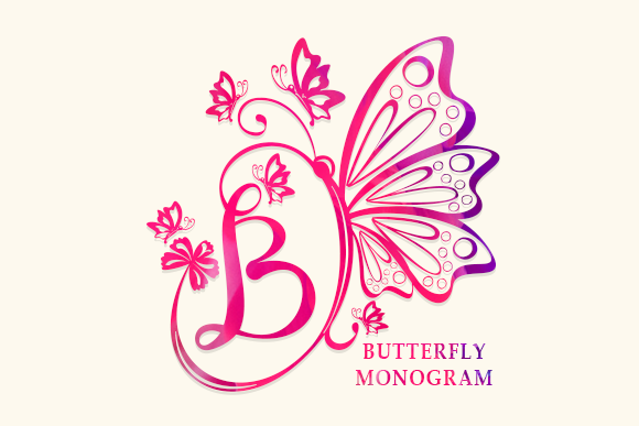
Butterfly Monogram Font
Ornamental monogram font
Official product preview · Image: Creative Fabrica
Butterfly Monogram fills a different role from the other nine selections. Rather than asking it to carry full sentences, use it for a small, memorable set of initials. The designer describes a decorative font with ornaments and specifically recommends it for wedding invitations and stationery art.
An initial-based motif can bring a suite together: the front of the invitation, a details-card corner, a favor sticker or an envelope seal can each repeat the same mark. A monogram is also useful when two fonts already have distinct duties and a third full typeface would feel like too much. Keep the crest separate from the content so guests do not mistake ornament for information.
This is not a replacement for an invitation’s readable text font. Check how the initials actually combine, how fine decorative details reproduce and whether a single-color version remains clear at small sizes.
Why it makes the list
- Distinctive initials-based visual motif
- Can unify multiple stationery pieces
- Provides decoration without another illustration
Consider before choosing
Not suitable for dates, names in full or long text.
Readability: Accent only, not body text.
Check the current listing and license before use.
How to Choose the Perfect Font for Your Wedding Invitations
Start by deciding what your invitation needs to communicate visually and what information guests must read. The first task is emotional; the second is practical. Wedding stationery succeeds when the two agree. Fancy lettering can announce a romantic, formal or relaxed atmosphere, while a more disciplined companion ensures that directions, timing and RSVP instructions stay crystal clear.
1. Match the lettering to the type of celebration
For a formal ceremony, a deliberate script such as Wedding Enchanting or a polished serif such as Ethereal creates a composed look. You can lean into symmetry, ample margins and a limited palette. Romantic garden celebrations have more space for the gentle motion of Maddison or Welcome. Baby Boho, meanwhile, suits outdoor weddings that use organic materials, informal wording or handmade details. A pared-back urban ceremony may work best with Ethereal or Minimalist and no script at all.
Do not decide from the font name alone. Type the couple’s actual names, including punctuation, accented letters and any ampersand, into the product preview or design software. “Anna & Leo” uses very different shapes and space from “Charlotte and Benjamin.” A typeface that balances one pair of names may crowd another, so look at the result instead of the marketing specimen.
2. Give each font a specific job
A dependable invitation hierarchy uses three levels: a large headline or names line, medium-size invitation wording, and small but readable logistics. Usually two font families can handle all three. Set the headline in calligraphy, reserve the details for a serif or sans, and create emphasis within that second face using weight, spacing or size. The result is more cohesive than bringing in a third decorative font for the date and a fourth for the venue.
Do not place long addresses, important dates, RSVP deadlines or access instructions in a flourished script. Guests should be able to copy an address or recognize the ceremony time without deciphering ornamental letters. Use the script for names and a few words; let the supporting type carry the facts.
3. Choose script, serif or sans serif deliberately
Script fonts have the strongest handwritten personality and can feel intimate or ceremonious depending on their stroke shapes. They are excellent for the central names line, a short welcome phrase, or a heading on the wedding program. Their connected letters, loops and swashes also make them the least forgiving option for information-heavy passages.
Serif fonts add a more editorial sense of structure. An elegant serif can act as the main display type, especially for modern-luxury stationery, and it often pairs gracefully with script. Watch out for very thin strokes on textured paper. Sans serif fonts feel contemporary and usually make strong companions for practical text. When they lack overt romance, bring character through paper color, layout, a restrained ornament or an expressive headline.
4. Test the exact size and paper before paying for a print run
A display specimen on a bright screen does not tell you what an invitation will look like on matte, laid, recycled or textured stock. Small loops can close up, fine strokes may look faint, and crowded baselines can lose the rhythm that makes script appealing. Print one card at its finished dimensions, ideally on a paper close to the final stock. Check it in ordinary daylight, not only under a design-studio lamp.
There is no universally safe font size because typefaces differ in their x-height, spacing and stroke weight. Start with comfortably readable supporting copy rather than trying to squeeze every line onto a smaller card. If the layout feels too crowded, shorten secondary wording, adjust the hierarchy or move travel information to a separate details card before shrinking the text. A beautiful invitation that guests cannot read has missed its essential purpose.
5. Use swashes and alternate glyphs sparingly
Several of the selected products, including Maddison, Pink Vibes Duo, Welcome, Baby Boho and Joseph Sophia, explicitly describe PUA-encoded alternate characters. PUA stands for Private Use Area, a method for accessing optional glyphs outside the default typing set. You may need a glyph panel or a character-selection tool rather than simply typing the letters from your keyboard. Creative Fabrica explains this in its PUA-encoded font guide.
The most effective use is often one alternate at the start or end of a name, not a flourish on every capital. A swash that crashes into a nearby line, runs too close to a trimmed edge or visually joins two separate names can make even an expensive card look untidy. Compare the default and alternate versions at print size, then keep whichever reads better.
6. Keep the full wedding suite consistent
Think beyond the main invitation: save-the-dates, details cards, RSVP cards, wedding programs, menus, table numbers and welcome signs all need to feel related. You do not need identical typography on every surface, but the same two-font system, key spacing decisions and ink palette will give the suite continuity. Pink Vibes Duo is especially convenient for this because the two styles were supplied together.
Large event-day signs usually allow more dramatic lettering than an RSVP card. That is fine. Increase the size of the established display font, but keep the informative lines in the established companion. When the system works at both extremes, your invitation suite is likely to feel intentional.
7. Understand licensing before selling or sharing stationery
Creative Fabrica offers commercial-use licensing, but the details depend on how the font is acquired and what you make with it. Its current subscription license permits many finished personal and commercial designs while restricting redistribution of the original font files, certain embedding uses and the creation of new font-based work after a subscription ends. The exact license applying to a separately purchased font may differ.
For personal invitations, create your artwork and send the printer a flattened or appropriately outlined production file rather than automatically sharing raw font files. If you design editable invitations for clients, sell templates, allow buyer customization or use web-based previews, confirm the applicable license explicitly. A downloadable font license is not automatically a license to host the font in a website editor.
Confirm the required characters and language support, read the actual font license, preview the real couple’s names, inspect a full-size print proof, and check that every RSVP link and address remains easy to read.
8. A simple approval checklist for your printer
- Names and date: Check capitalization, ampersands, accent marks and exact spelling against the approved wording.
- Hierarchy: Make sure the date, ceremony time and venue are visually obvious at a glance.
- Contrast: Test the final ink color on the intended paper; a pale pink that looks beautiful on screen can be faint in print.
- Margins and swashes: Leave safe space around long tails, flourishes and any decorative initials.
- Production: Ask the printer whether outlined text or a print-ready PDF is preferred, and confirm the proof before authorizing the full quantity.
Wedding Font Pairing Ideas That Actually Work
Use these as starting points rather than rules. The strongest pair gives the decorative line room to be noticed without making the invitation’s essential information compete for attention.
| Wedding mood | Headline or names | Supporting type | Layout suggestion |
|---|---|---|---|
| Romantic garden | Maddison | Ethereal | Large flowing names, quiet serif lines below |
| Boho outdoors | Baby Boho | Minimalist | Loose script headline, clean left-aligned details |
| Modern minimal | Ethereal | Minimalist | Serif names with spacious sans captions |
| Formal evening | Wedding Enchanting | Ethereal | One ceremonial script line, centered supporting text |
| Romantic contemporary | Pink Vibes Script | Pink Vibes Sans | Use the matched duo across invites and RSVP cards |
| Personalized stationery | Welcome + small Butterfly Monogram | Minimalist | Ornamental initials at top, simple event wording below |
Names here refer to the products above. These combinations are editorial design suggestions, not verified font rendering or measured readability results.
Frequently Asked Questions About Wedding Invitation Fonts
What is the best font for wedding invitations?
Maddison is our all-around romantic-script recommendation for couples who want a graceful names line. The best complete invitation, however, usually combines a display face such as Maddison with a clear serif or sans for details. For a more modern look, Ethereal or Minimalist may be a better starting point.
Can I use two different fonts on one invitation?
Yes. In fact, using two carefully assigned font families is often more effective than forcing one decorative script to do everything. Give the expressive style the names or heading, and give the companion the venue, ceremony time and RSVP details. You can use different weights or sizes within that system.
Are calligraphy fonts hard to read?
Some are difficult at small sizes, particularly when letters connect tightly or flourishes cross neighboring lines. Restrict ornate calligraphy to short text, view the actual names rather than a sample image, and use a more regular companion for practical information. A full-size paper proof is essential.
Should wedding invitations use serif or sans serif fonts?
Both work. Serifs often lend a classic or editorial feeling; sans serifs feel clean and contemporary. The ceremony style matters more than a blanket rule. Pick the family that fits the couple’s aesthetic and reads clearly on the chosen stock.
Can I use Creative Fabrica fonts on invitations I sell?
Many finished wedding-stationery products are allowed under Creative Fabrica’s commercial-use terms, subject to the license attached to the download. Redistributing the underlying font files and certain embedded or editable uses are restricted. Read the applicable license before making products for sale or giving files to a client.
How do I use extra swashes in a wedding font?
Check whether the product includes PUA-encoded characters or OpenType alternates. Depending on your software, you can select extra glyphs through a font glyph panel, Windows Character Map or macOS Font Book. Add them conservatively so they do not collide with other letters or trim margins.
What if we want an invitation without cursive lettering?
Choose Ethereal for an elegant serif-led design or Minimalist for a spare modern look. Distinct type sizes, considered line breaks, beautiful paper and measured spacing can add more sophistication than another ornamental font.
Final Recommendation: Choose the Mood, Then Protect Readability
For soft romantic lettering, begin with Maddison. For a coordinated invitation suite, Pink Vibes Duo is particularly practical. Ethereal offers a strong serif direction if you prefer elegant type without traditional calligraphy, while Baby Boho brings a relaxed tone to an outdoor celebration. Give the final choice a real job on the page, pair it with a calm supporting font, and approve a printed proof before committing to the full run.